WeWork.com Global Homepage
2022
Design Director: Elayne Safir
Product Manager: Cyara New
Content Strategy Lead: Jenny Muller
Product Designer: Marcus Djuhadi
Challenge
WeWork.com serves as the most prominent, public-facing expression where people learn about the company and its services. Its homepage has two objectives: to promote what WeWork stands for and launch users into flows encouraging conversion. A research sprint revealed opportunities to fortify a hero moment and accomplish both goals.
Outcome
During a six-week sprint, I designed a new homepage vision focused on a more strategic and actionable hero experience. I explored ways to balance product education and conversion within the acquisition journey. The first phase of the redesign launched in an A/B test and increased product page click-through rate by 15%.
During a six-week sprint, I designed a new homepage vision focused on a more strategic and actionable hero experience. I explored ways to balance product education and conversion within the acquisition journey. The first phase of the redesign launched in an A/B test and increased product page click-through rate by 15%.

I was brought onto the Consumer Experience team to help lead a growth-oriented vision for the WeWork.com homepage.
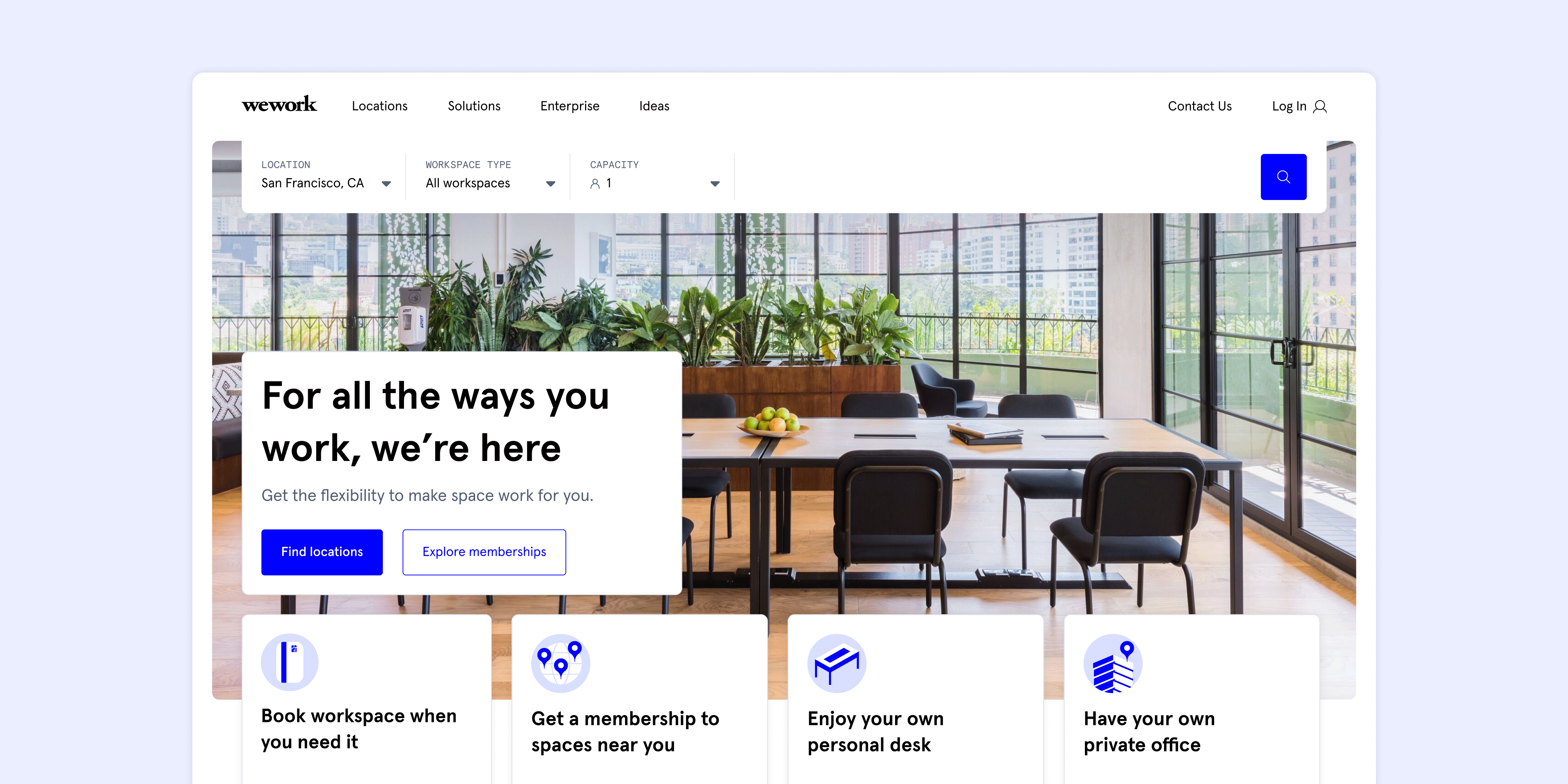
Below is a screenshot detailing the homepage’s original state. A study by the UX research team uncovered this approach lacked a compelling value prop, failed to clarify what actually distinguishes offerings, and left little room for marketing to test content easily.
The top module prompted users to select a city then launched them into the search flow. Paired with a “Start” CTA, this was an abrupt entry point with low engagement compared to the site’s global nav. The workspace overviews underneath offered little insight as to what makes each unique.
The top module prompted users to select a city then launched them into the search flow. Paired with a “Start” CTA, this was an abrupt entry point with low engagement compared to the site’s global nav. The workspace overviews underneath offered little insight as to what makes each unique.

I first met with our researchers to discuss their insights in-depth and reach a consensus on what to solve for.
I began by working closely with the UX research team to dig deeper into their findings. They had identified six user archetypes visiting WeWork.com—ranging from high-intent users ready to find workspace immediately, to low-intent browsers exploring what WeWork offers.
These insights helped us recognize that the homepage needed to support multiple entry points into the experience, rather than pushing every visitor directly into search.
These insights helped us recognize that the homepage needed to support multiple entry points into the experience, rather than pushing every visitor directly into search.

As a storytelling artifact, I expanded each archetype into a journey to convey different user entry points and engagement moments across the experience.
To make the research more actionable, I expanded the archetypes into end-to-end journeys that illustrated how different users might interact with the homepage. These journeys helped the team align on two key goals:
For example, one archetype, Deidre, represented a team manager evaluating workspace options for a rapidly changing team. Her journey highlighted the need for clearer product comparisons and faster access to relevant information.
-
Provide fast access for high-intent users
-
Offer clear education and discovery for lower-intent visitors
For example, one archetype, Deidre, represented a team manager evaluating workspace options for a rapidly changing team. Her journey highlighted the need for clearer product comparisons and faster access to relevant information.

With these goals defined, we began exploring solutions in low fidelity to iterate quickly.
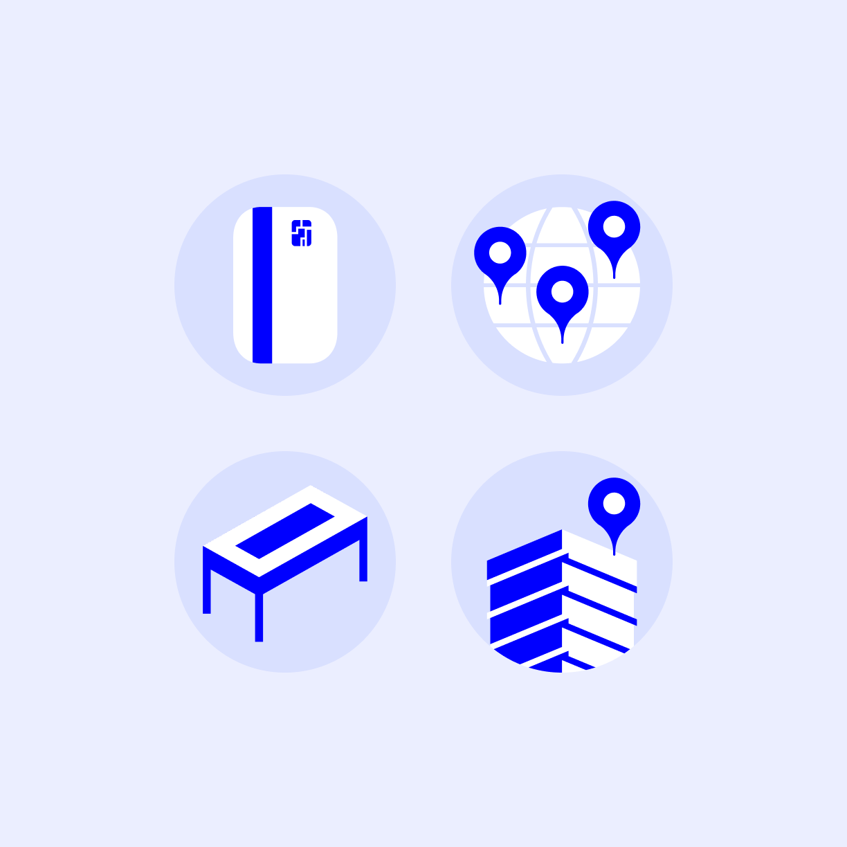
Some core ideas emerged that enabled the hero area to function both as an actionable entry point and an educational moment.
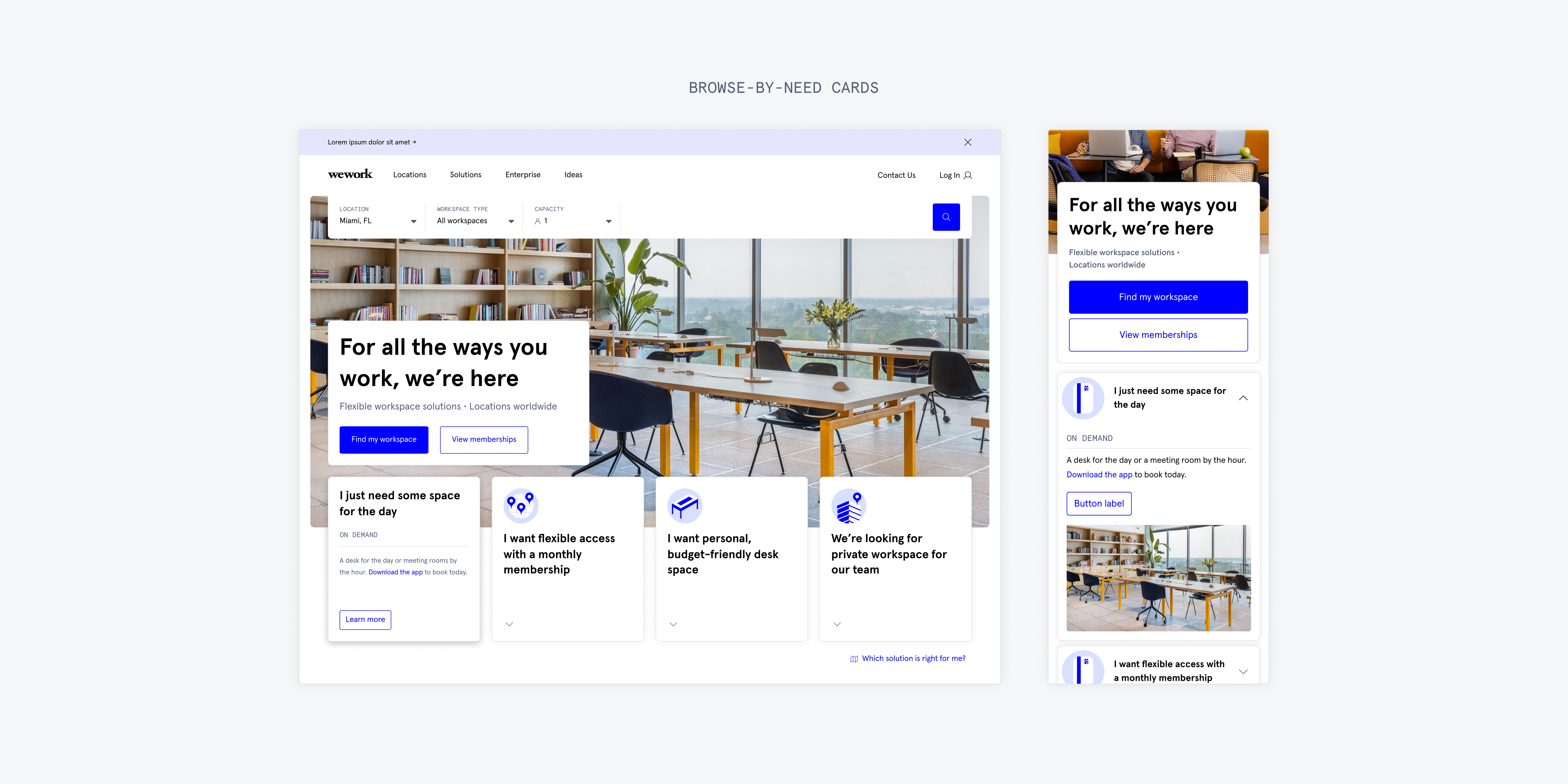
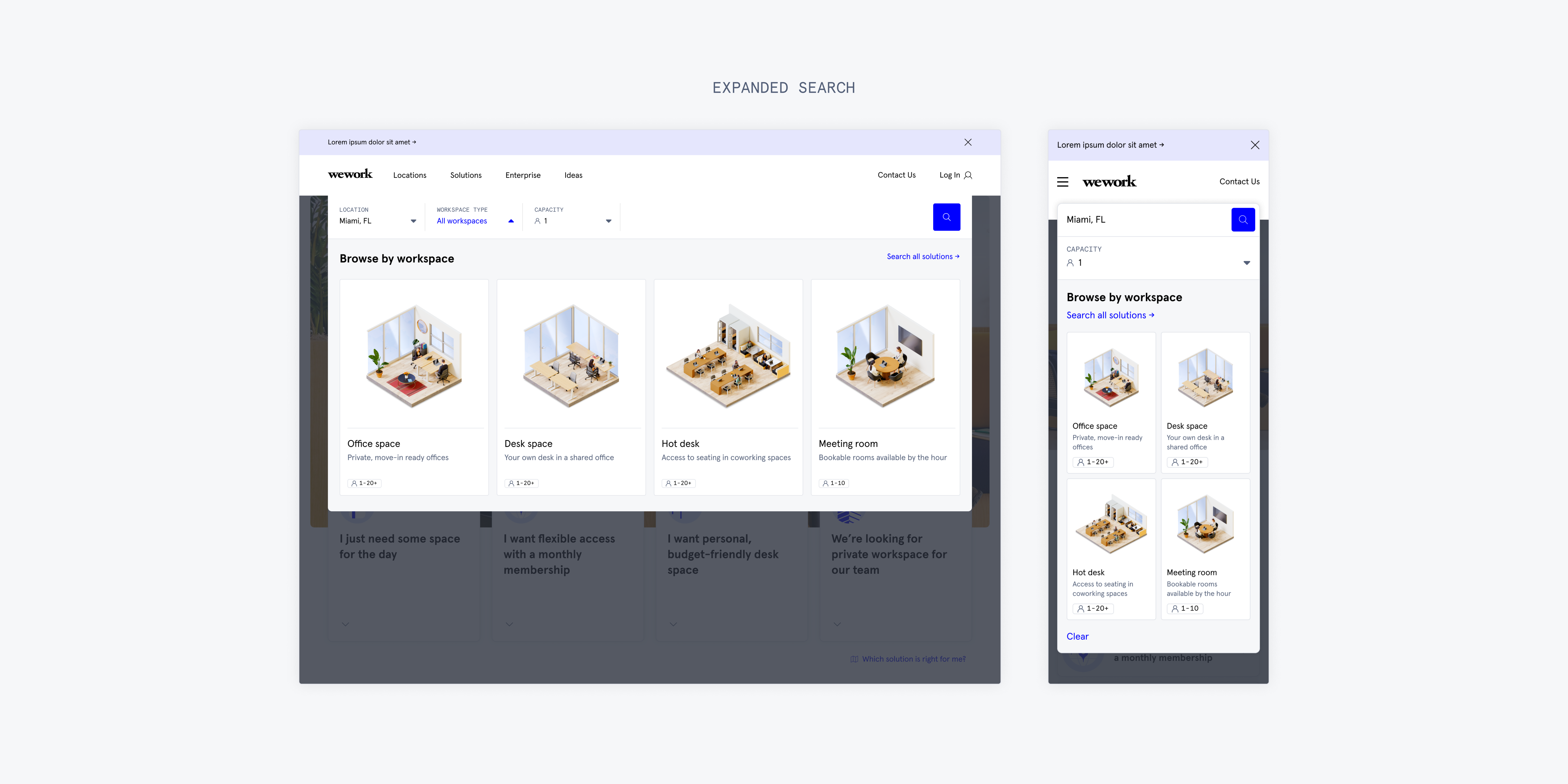
- Immediate search access
A prominent search bar would allow high-intent users to quickly find workspace in their desired city. - Discovery by need
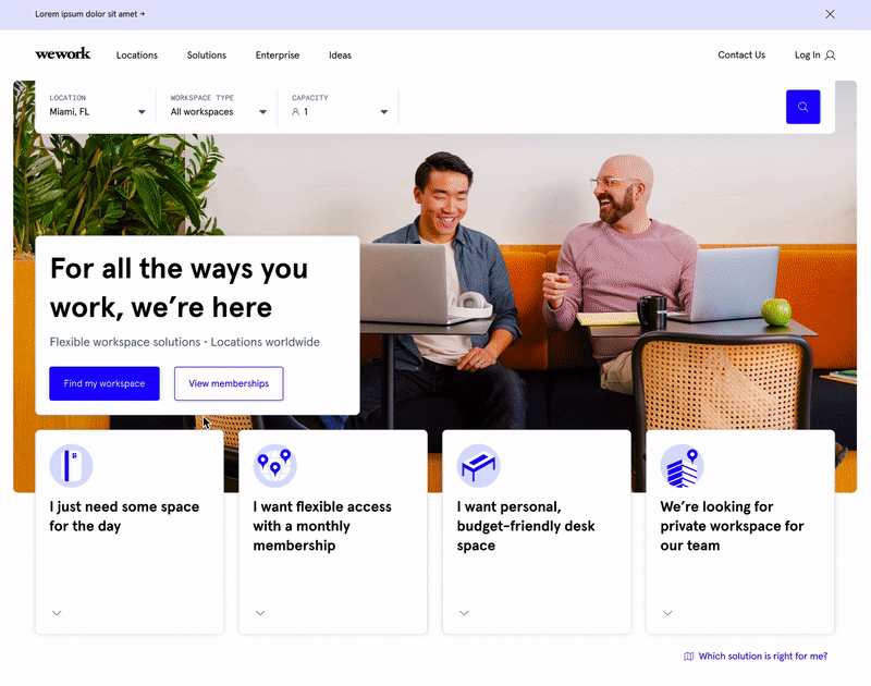
For users still exploring, we introduced “browse-by-need” cards that framed WeWork offerings around common use cases.
Each module was an opportunity to experiment and use the hero area to convey information in a tactical, action-oriented manner.
Working closely with a content strategist, I helped shape how WeWork’s offerings were explained and structured. We iterated on a set of “browse-by-need cards” that communicated who each option is for, when it makes sense to use it, and how it differs from other offerings.
Compared to the existing workspace overview modules, these cards gave visitors clearer guidance on choosing the right solution.
Compared to the existing workspace overview modules, these cards gave visitors clearer guidance on choosing the right solution.
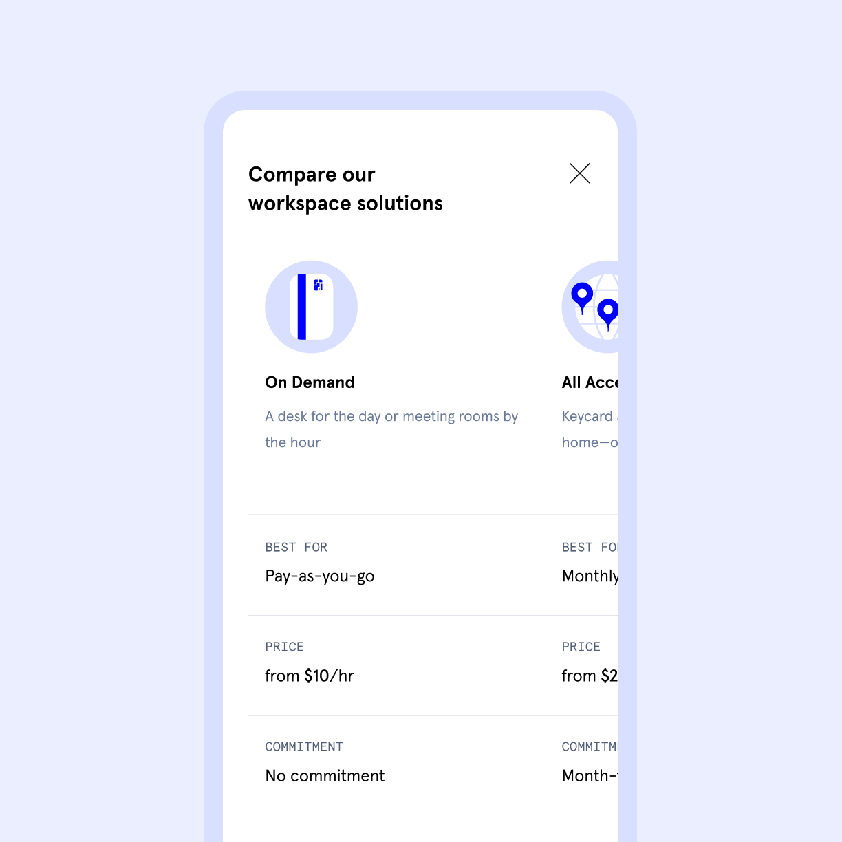
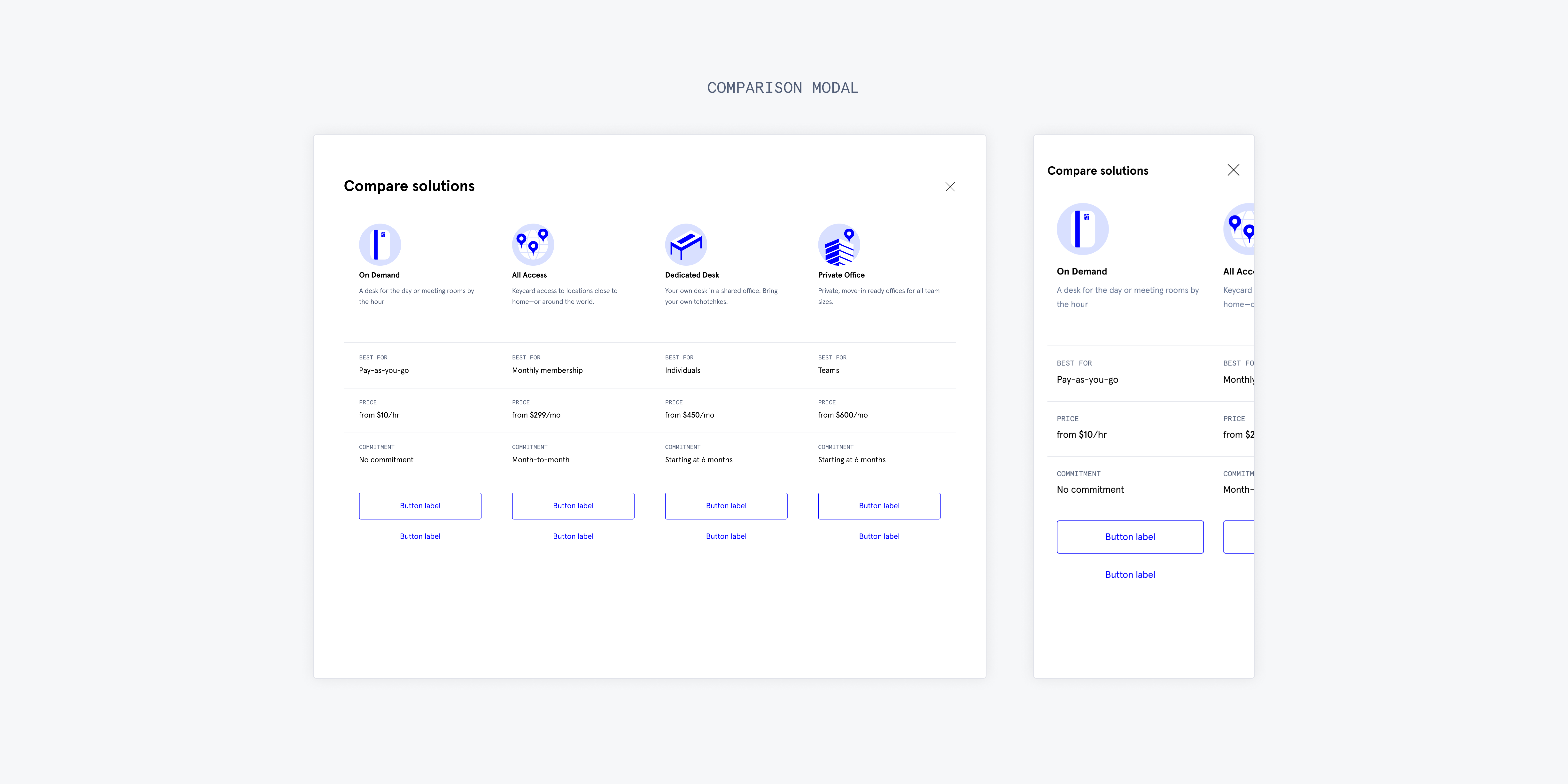
While the browse-by-need cards improved discovery, we also explored whether users needed an easier way to compare offerings.
I designed a comparison modal that displayed key attributes across workspace types in a table format.
Although WeWork memberships aren’t strictly tiered products, this exploration tested whether a scannable comparison model could reduce decision friction.
Although WeWork memberships aren’t strictly tiered products, this exploration tested whether a scannable comparison model could reduce decision friction.

As we explored each module, we knew it was important to convey how each idea would come to life—especially when seeking stakeholder buy-in.
This signaled the need to move to a higher fidelity. I began investigating the visual design details of our work, working in the same incremented focus across each of our three modules: the browse-by-need cards, search bar, and comparison modal.
Below are prototypes I made for variations of the browse-by-need cards. I was curious how additional interactive states could reveal more information. I connected with teammates to gather input on how we present these offerings elsewhere in the customer journey.
Below are prototypes I made for variations of the browse-by-need cards. I was curious how additional interactive states could reveal more information. I connected with teammates to gather input on how we present these offerings elsewhere in the customer journey.
As the concepts matured, I shifted continuously between detailed exploration and system thinking.
I found great success in knowing when to zoom in and out during this initiative. This meant dedicating time to refining visual elements like icons, hierarchy, and interactive states while also stepping back regularly to evaluate how each module supported acquisition goals.

With the three core modules defined, I began exploring how they would come together in the hero.
Over a week, I produced multiple visual directions and shared them in an all-team critique.
This sparked a broader discussion about how the homepage should relate to WeWork’s design system. We noticed inconsistencies across products, particularly around the use of abstract shapes and imagery.
To align the team, I helped facilitate a workshop where designers reviewed current patterns and established guidelines for how these visual elements should be used moving forward.

From our explorations, we narrowed the work to three directions for stakeholder review.
I advocated for an approach that balanced clarity with visual warmth, avoiding overwhelming users with too much information while still highlighting the energy of WeWork spaces.
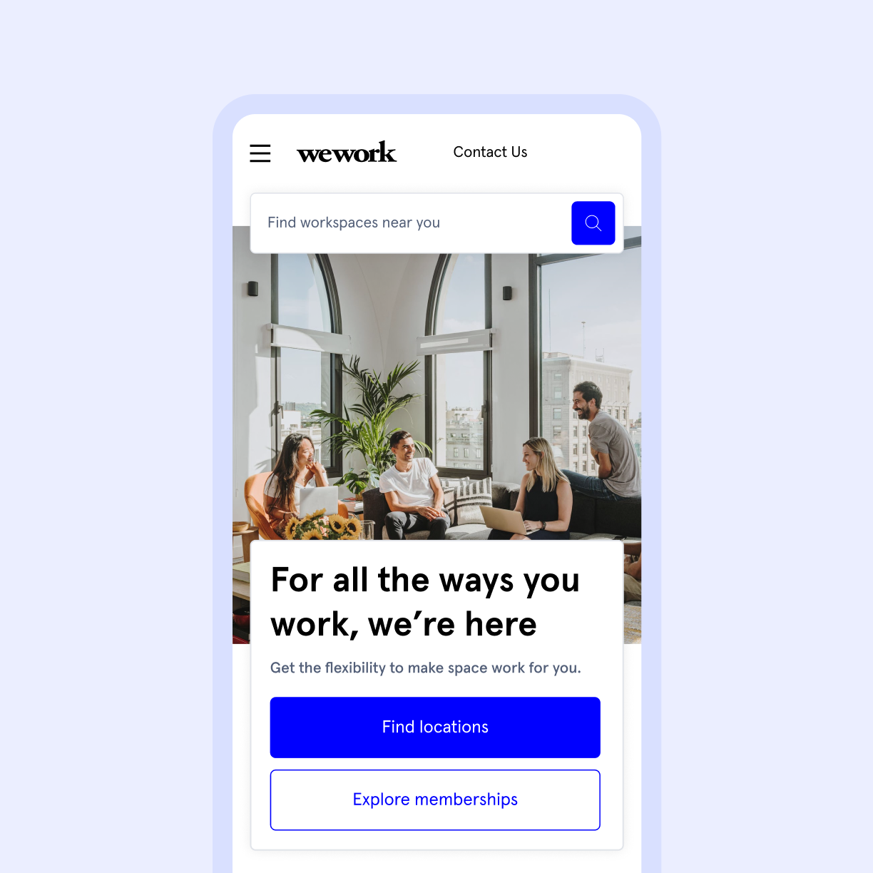
The team ultimately selected Direction C, which paired each browse-by-need card with a single featured image. This allowed content and visuals to reinforce each other while keeping the interface focused.
The team ultimately selected Direction C, which paired each browse-by-need card with a single featured image. This allowed content and visuals to reinforce each other while keeping the interface focused.
I created high-fidelity prototypes of the homepage to support internal walkthroughs and leadership presentations.
To ensure the experience would scale globally, we also partnered with localization stakeholders to validate longer languages such as German and right-to-left layouts for Arabic. This helped ensure the design could support WeWork’s global audience.

Final Designs
The hero and browse-by-need modules launched in a controlled rollout to measure performance against the existing homepage.
In A/B testing, the redesign produced a 15% increase in product page click-through rate, validating the new approach to product discovery and entry into the acquisition flow.
In A/B testing, the redesign produced a 15% increase in product page click-through rate, validating the new approach to product discovery and entry into the acquisition flow.
I learned so much from working alongside such a brilliant team.
This project was a collaborative sprint that brought together research, design, and content strategy to rethink WeWork’s most visible digital experience.
Joining the Consumer Experience team midstream meant quickly ramping up on context while contributing fresh perspectives. The process pushed me to experiment, navigate ambiguity, and challenge assumptions around how the homepage could better support different user journeys.
I’m proud that the work not only improved conversion metrics, but also helped establish a clearer foundation for how WeWork communicates its offerings online.