Spacestation Events
2022
Product Manager: Babs Peterson
Engineering Manager: Travis Shields
Product Designer: Marcus Djuhadi
Challenge
Spacestation is a space management tool empowering WeWork’s Community Teams to create a world-class member experience at every location. At the time, this platform had not yet leveraged the team’s new design system, Ray. As engineering reworked back-end infrastructure, there was an opportunity to not only refresh but also improve core features.
Spacestation is a space management tool empowering WeWork’s Community Teams to create a world-class member experience at every location. At the time, this platform had not yet leveraged the team’s new design system, Ray. As engineering reworked back-end infrastructure, there was an opportunity to not only refresh but also improve core features.
Outcome
I redesigned multiple flows integrating WeWork’s new design system, starting with event creation and management. Advocating for larger changes that center stakeholder needs, I leveraged rapid prototyping and user testing to inform decision-making. This project was pivotal in establishing a unified ecosystem for WeWork’s employees around the world.
I redesigned multiple flows integrating WeWork’s new design system, starting with event creation and management. Advocating for larger changes that center stakeholder needs, I leveraged rapid prototyping and user testing to inform decision-making. This project was pivotal in establishing a unified ecosystem for WeWork’s employees around the world.
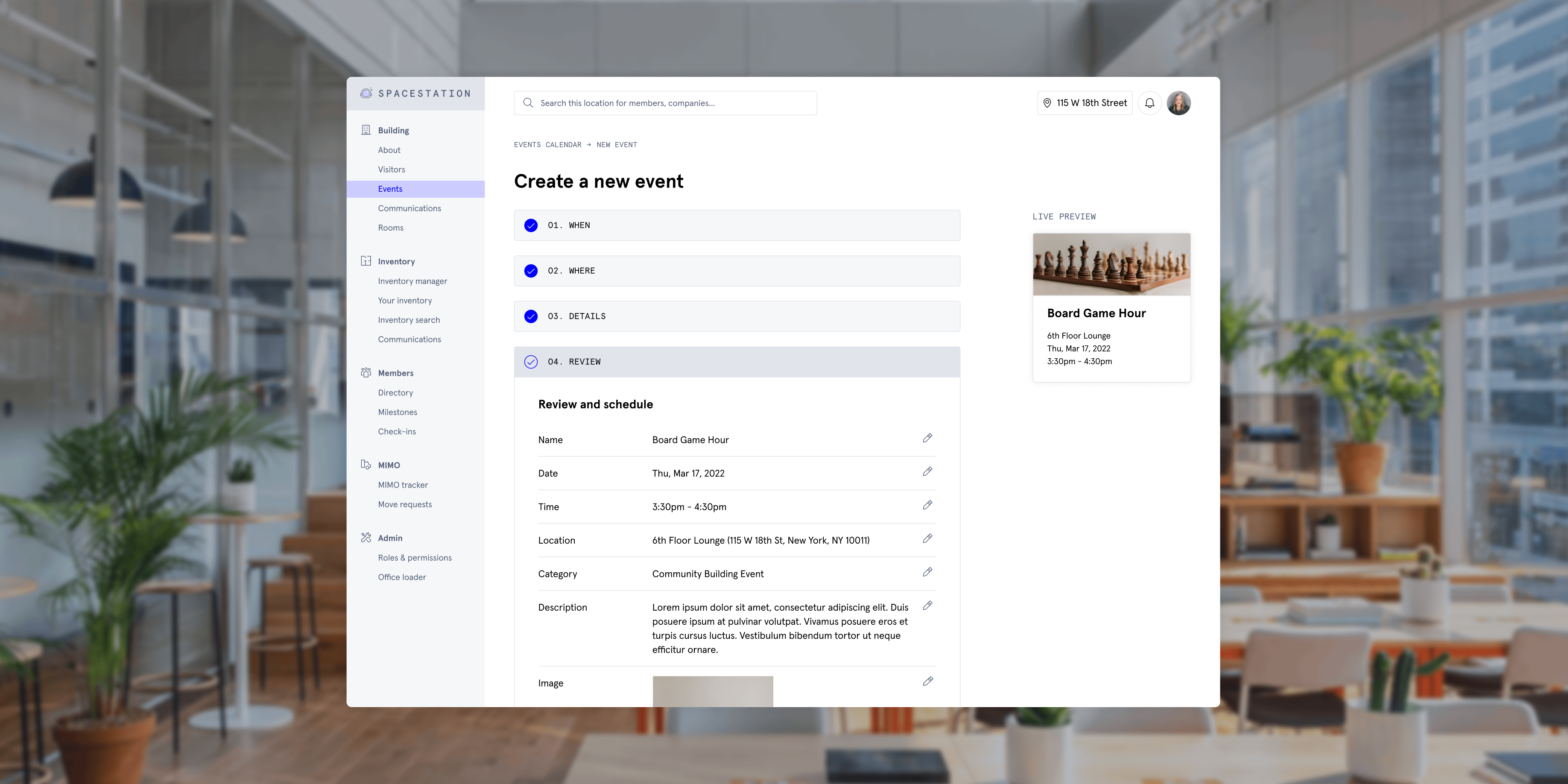
As WeWork continues to evolve its design system, Ray, a core goal is to ensure all products look and feel the same.
Prioritized for adopting the new system, Spacestation demonstrated immense potential for improvement. I facilitated informal conversations with Community Teams to understand which flow should be the first to tackle—learning that event creation was seen as the most outdated and inefficient feature. It hadn’t been revisited in years yet was an integral part of employees’ role to cultivate community from week-to-week.
In this flow, users plan and add events to the building calendar. They fill out a form with details like date and time, sort through potential locations around the office space, then jazz it up with a photo. The event is then published and visible to members at the location.
In this flow, users plan and add events to the building calendar. They fill out a form with details like date and time, sort through potential locations around the office space, then jazz it up with a photo. The event is then published and visible to members at the location.
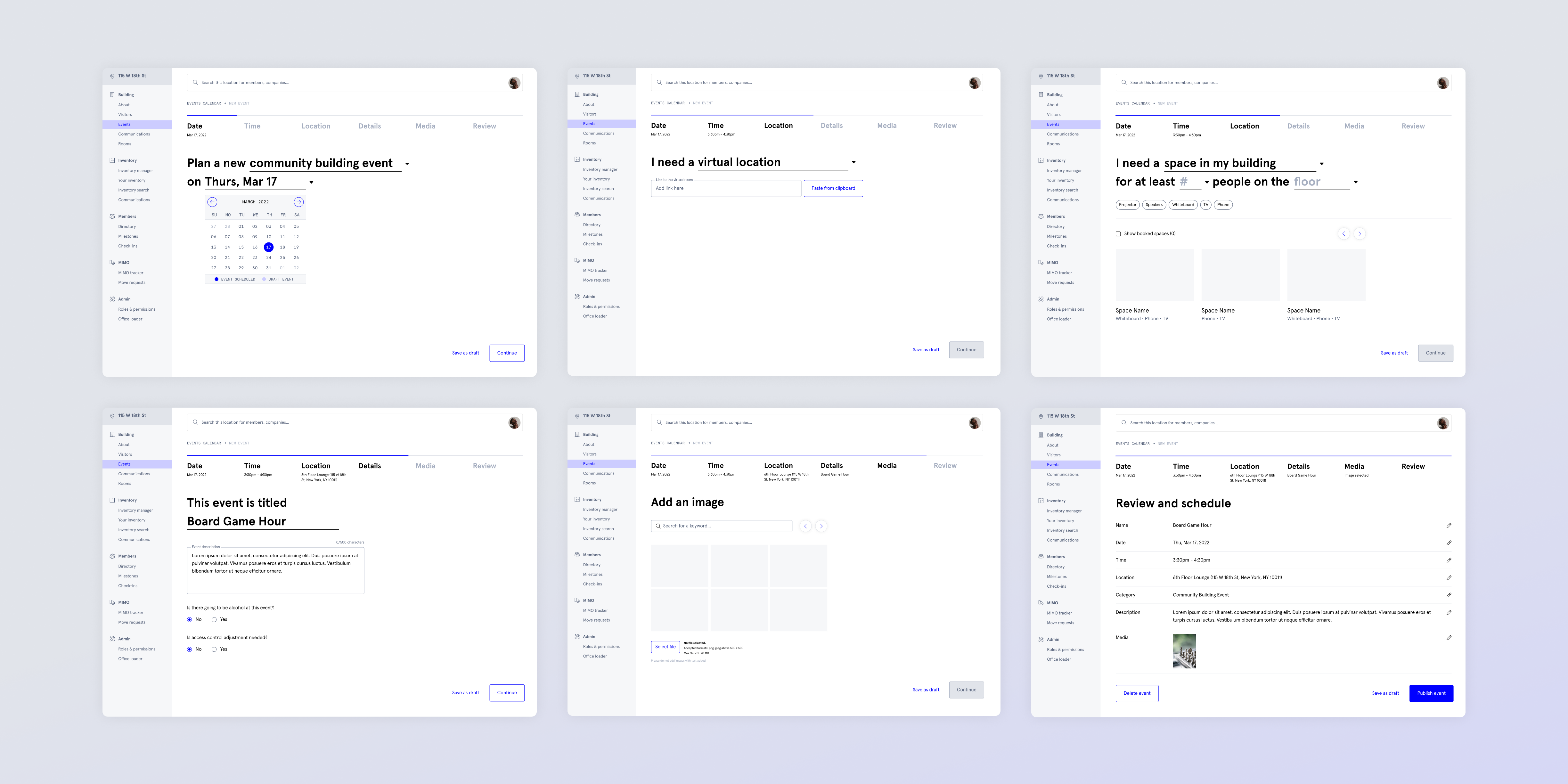
My first approach was a 1:1 refresh.
My PM and I agreed this event creation flow was a strong starting place to pressure test how to best refresh Spacestation using the Ray Design System.
Adhering to the initial scope, I first rebuilt the entire flow using our new component library. Although this involved no major changes in functionality, it required a detail-oriented process to capture nuances.
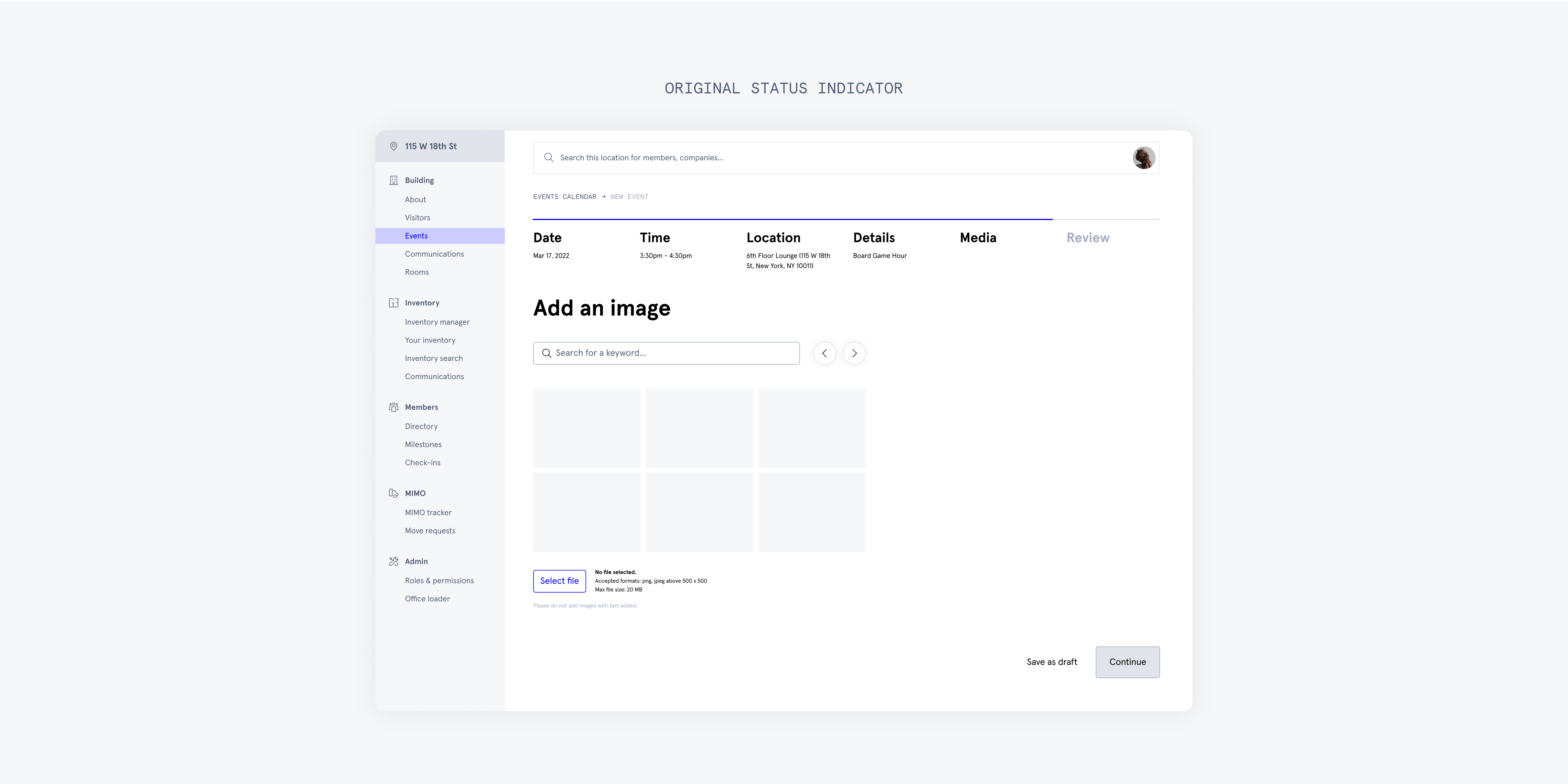
For instance, I explored various options for a status indicator—a pattern which had not yet existed in Ray. I reviewed other progression-based instances spanning our platforms to inform the selected direction.
For instance, I explored various options for a status indicator—a pattern which had not yet existed in Ray. I reviewed other progression-based instances spanning our platforms to inform the selected direction.

With the improvements of this new system, the visual refresh was more cohesive and legible.
Beyond exploring how elements like the status indicator should work with our new design system, this process was fast; I delivered the 1:1 refresh in a few days. I believe that’s a testament to the effectiveness of the system itself, and as this project was early during my time at the company, it taught me how to leverage and work with the design system.
However, as I worked to rebuild this flow, I had a lot of questions as to why this process worked the way it did.
However, as I worked to rebuild this flow, I had a lot of questions as to why this process worked the way it did.
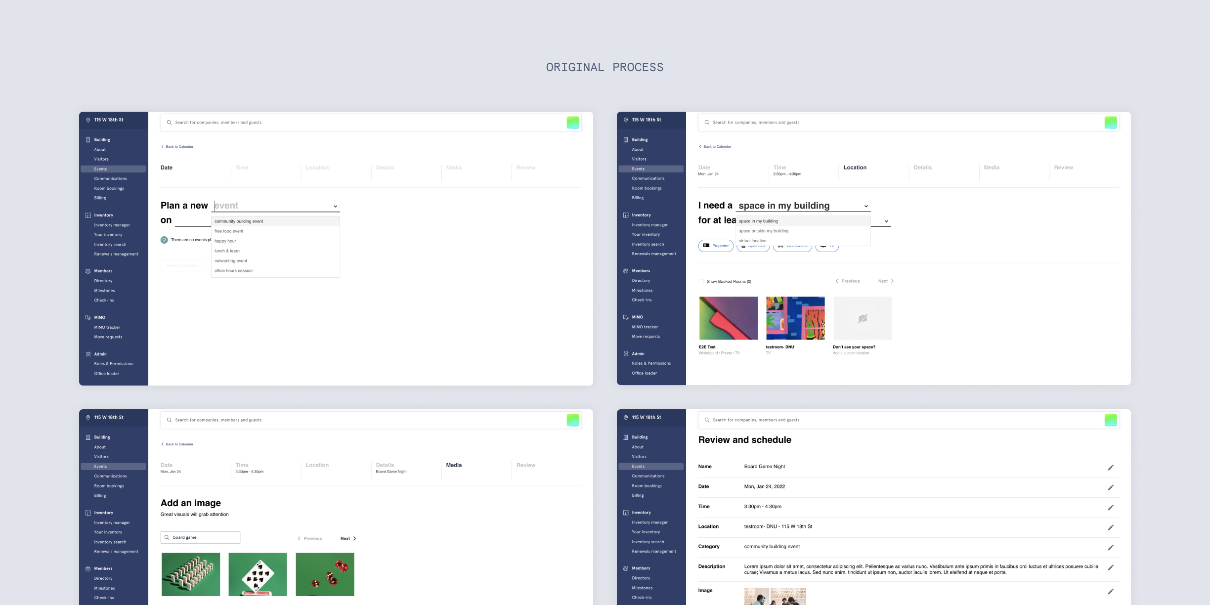
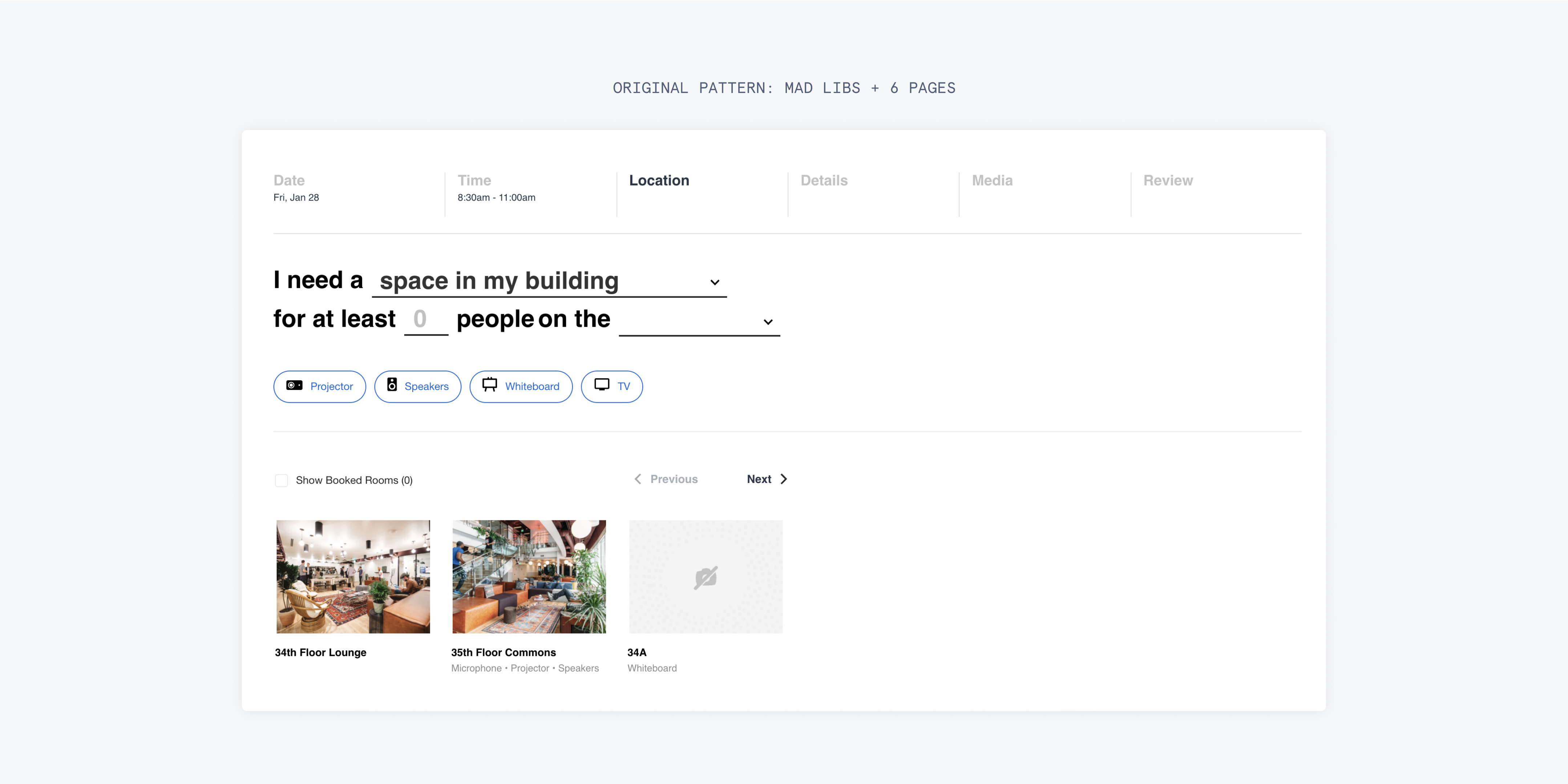
The original process is presented as a “mad libs.”
In the original process, users are required to type details into a sentence format. While a conversational approach may be appropriate for more personable contexts, event creation is one of many tasks Community Teams complete in their daily workflow.
This input method creates a major point of friction, so I decided to investigate how this process could better serve its users’ needs.
This input method creates a major point of friction, so I decided to investigate how this process could better serve its users’ needs.
With my second approach, I explored larger changes.
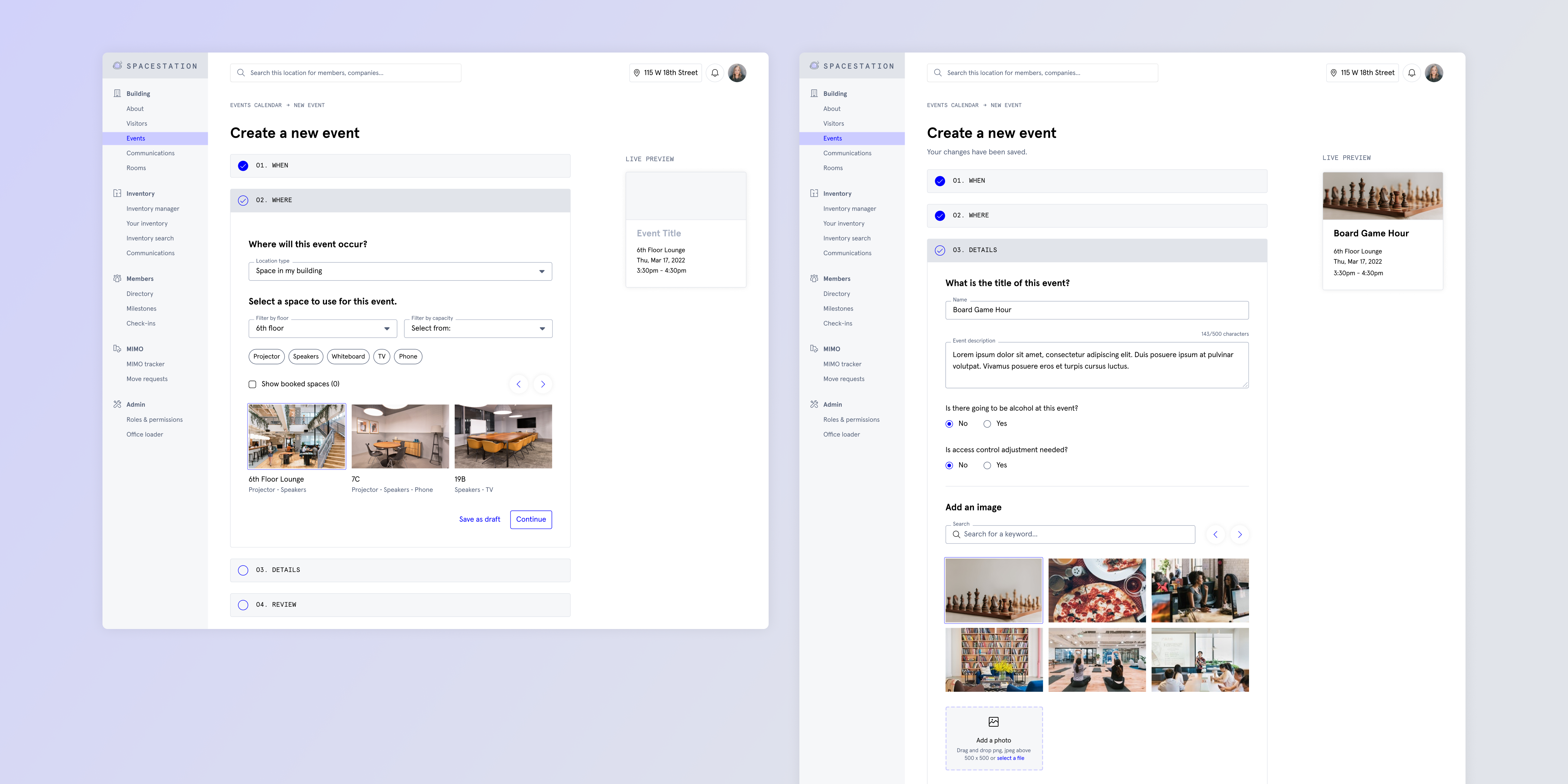
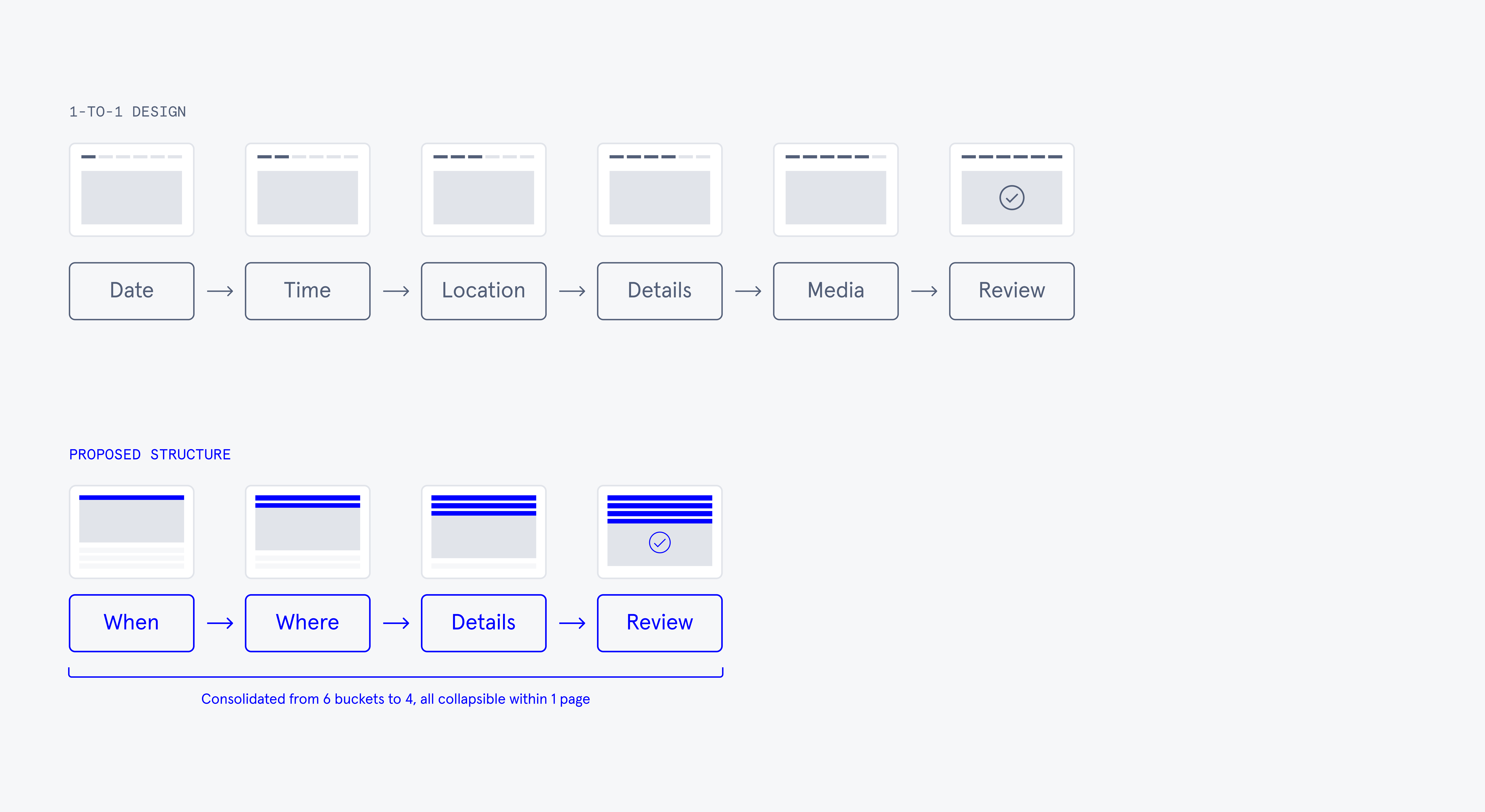
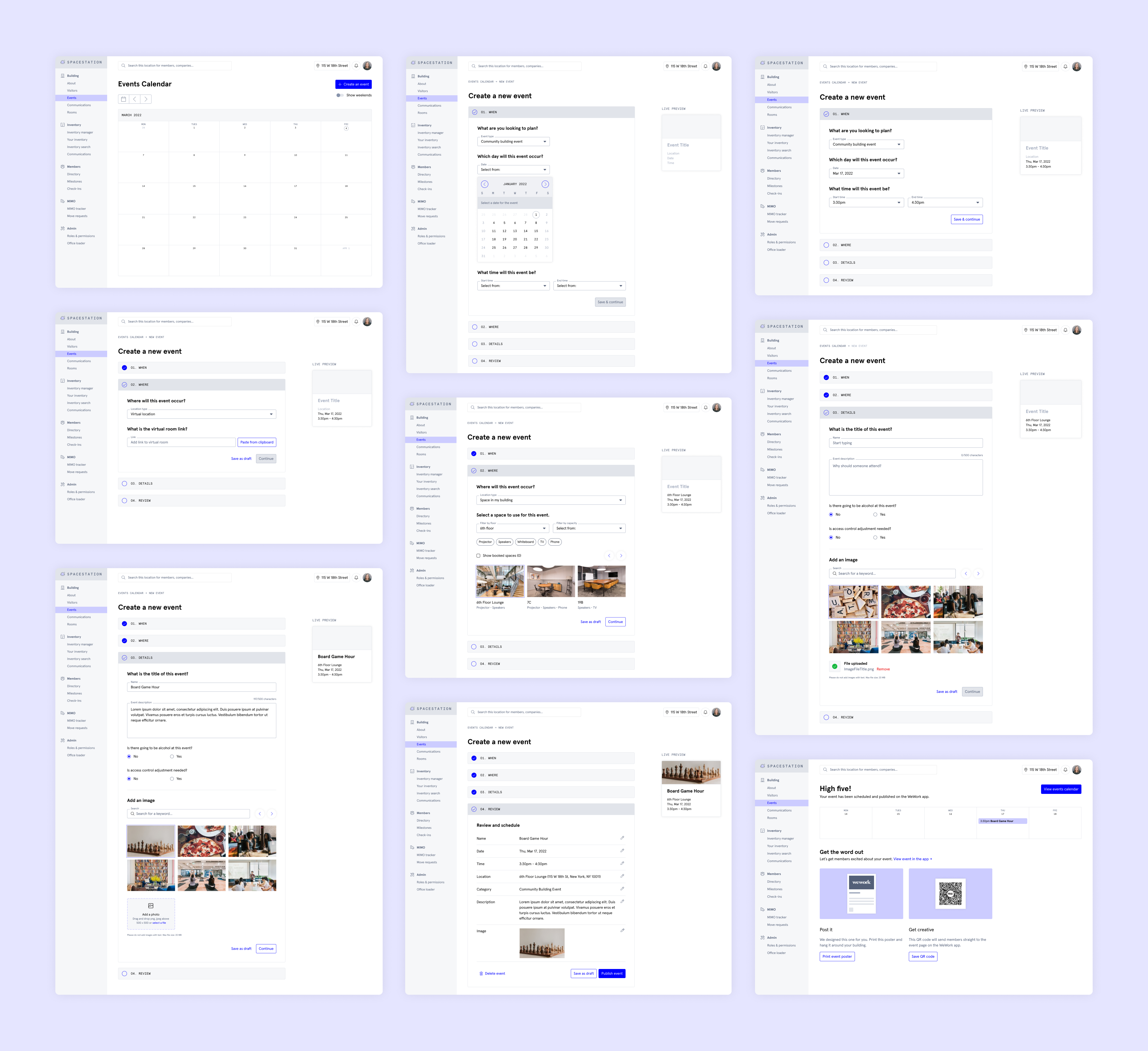
I proposed an alternative approach to streamline the flow and improve navigational clarity. By switching to a collapsible structure, I could consolidate the number of screens while still collecting all the necessary information.
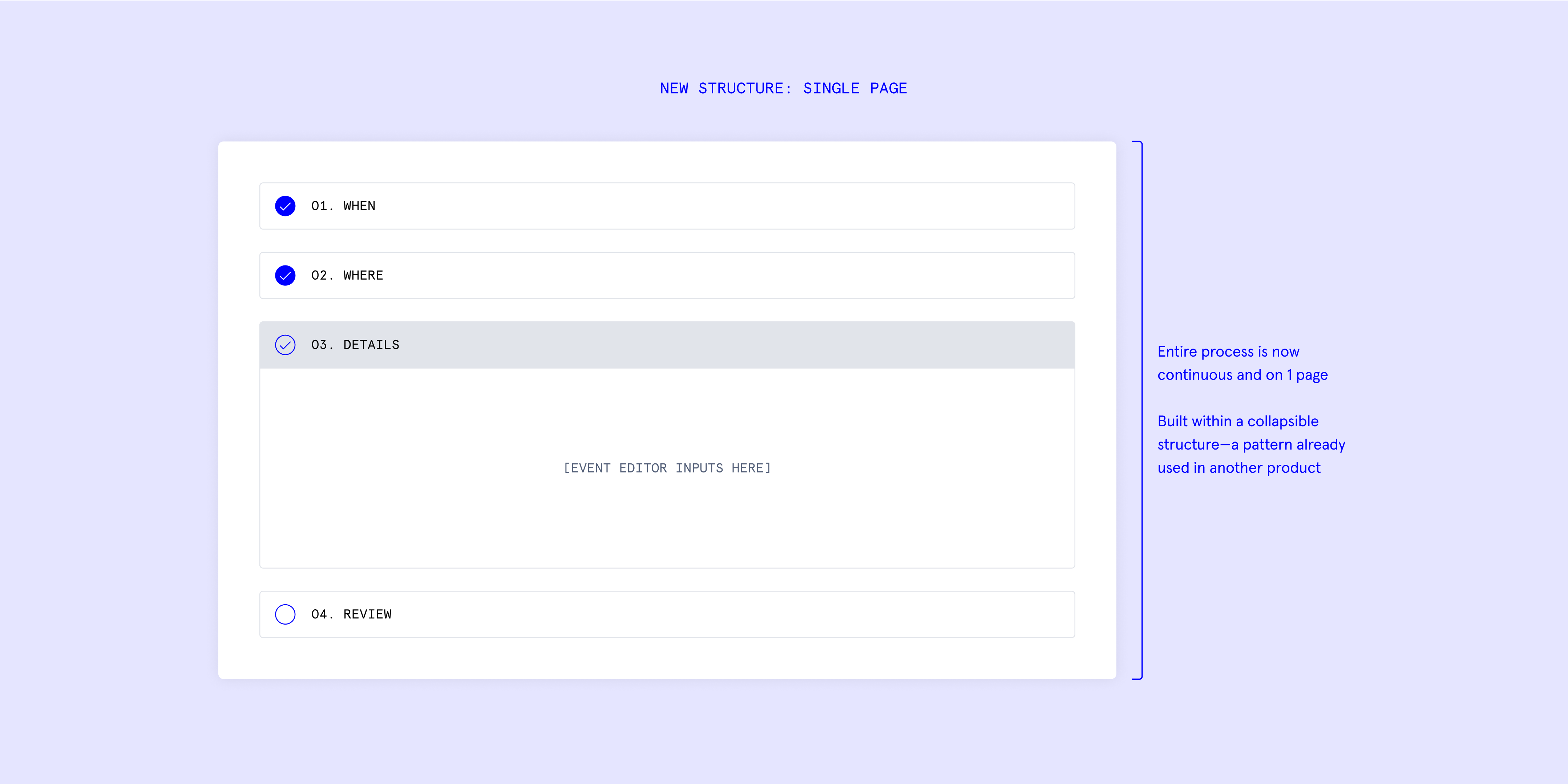
Now, the entire process to plan an event could be continuous and exist on one page, which aligns more closely with patterns established in other internal tools. The mad libs would be replaced by text and dropdown inputs, reducing from six buckets to four.
Now, the entire process to plan an event could be continuous and exist on one page, which aligns more closely with patterns established in other internal tools. The mad libs would be replaced by text and dropdown inputs, reducing from six buckets to four.
To demonstrate how this new flow could work, I mapped out the logic across different scenarios.
I asked one of the engineers on the team to help me think through the edge cases here, as they were familiar with how the original flow was implemented. This diagram shows how the acceptance criteria to advance to the next step works, depending on user input.
For example, they can still save their progress and proceed to the next step as long as they’ve selected a date. This anchors the event draft on the calendar, and placeholder text replaces the other fields. If a date isn’t added, then the CTA to progress remains inactive.
For example, they can still save their progress and proceed to the next step as long as they’ve selected a date. This anchors the event draft on the calendar, and placeholder text replaces the other fields. If a date isn’t added, then the CTA to progress remains inactive.

Once the overarching flow made sense, I was curious what might be more effective ways to summarize the inputs instead of the status indicator explored previously.
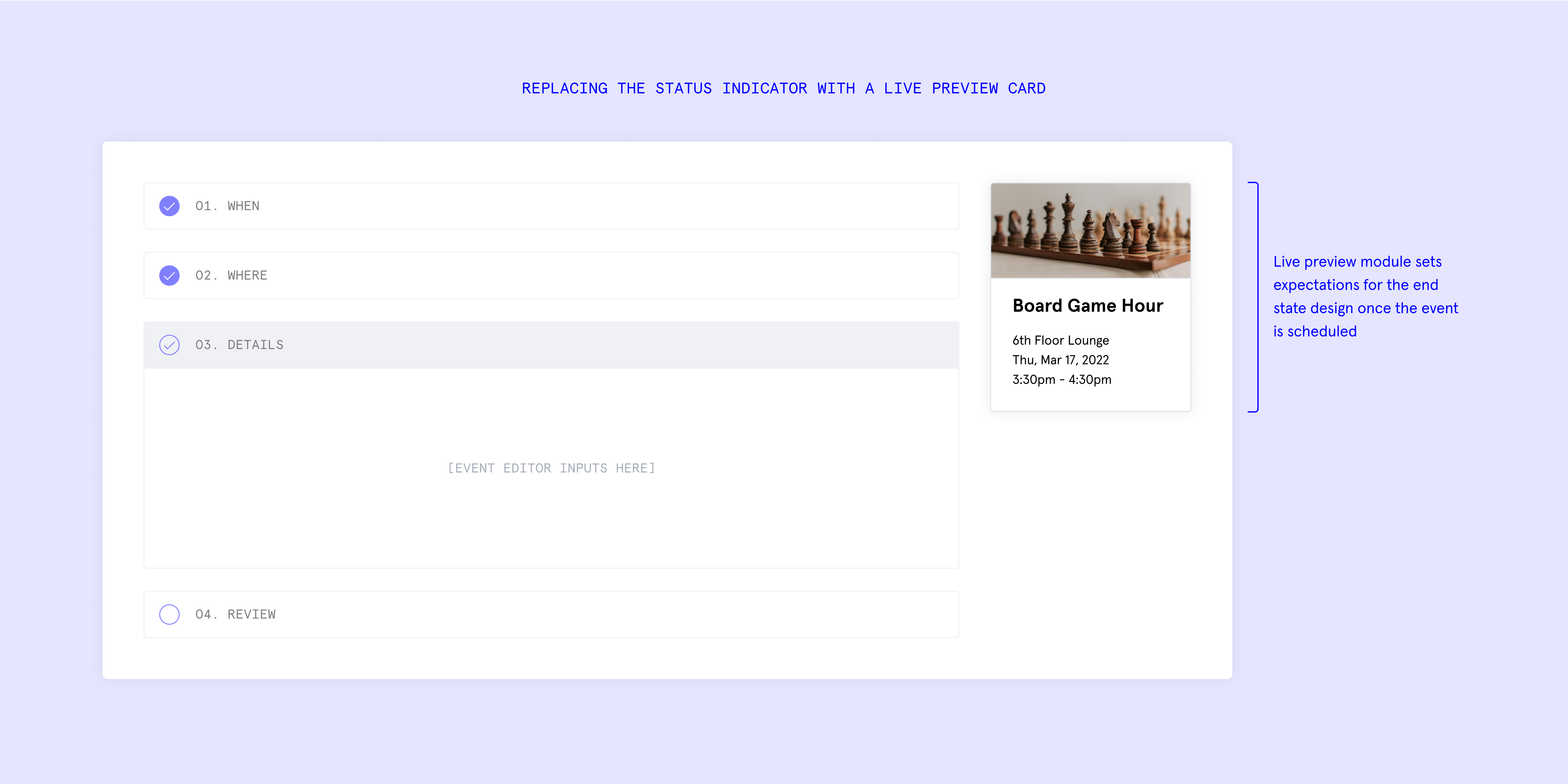
The original status indicator takes up a good chunk of the screen, yet details like location remain subtle. It’s unclear that these update live as users edit them. A neat feature of the original design was that, once a user added an event to the calendar, users could see a card previewing the title, location, and time. This felt like a clear, snackable event summary packaged in one container.
As another iteration, I replaced the status indicator with this card—which could also set expectations for the event in its end state once scheduled.
When I showed my work to the other Spacestation designers, the reaction was a mix of excitement and hesitation. The biggest tradeoff of this approach was that it would require a larger engineering lift than a 1:1 refresh. Resourcing was limited, so I opted to conduct user testing and evaluate the impact of these changes in the meanwhile.
I also focused my attention to refining related components across the flow.
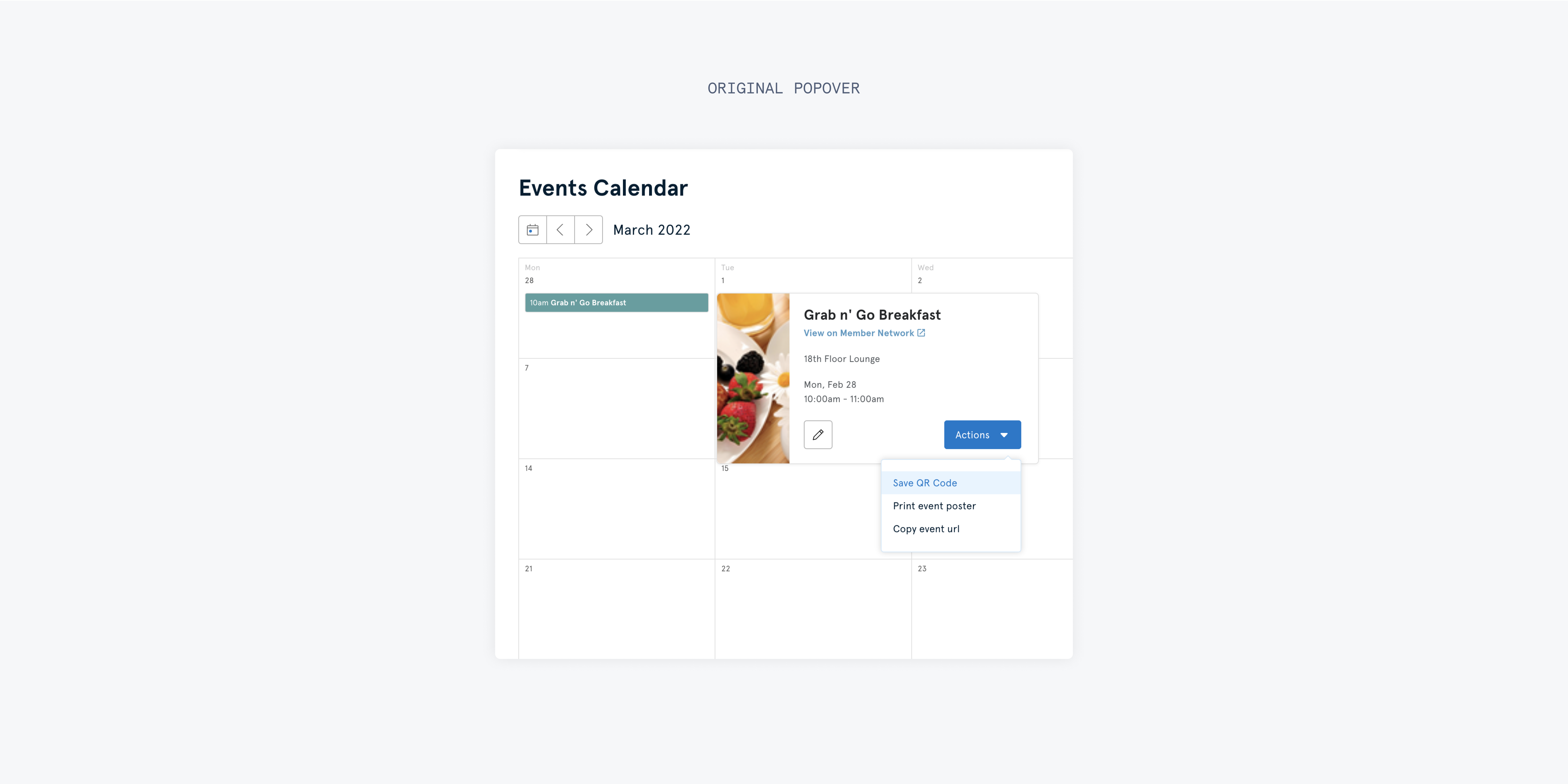
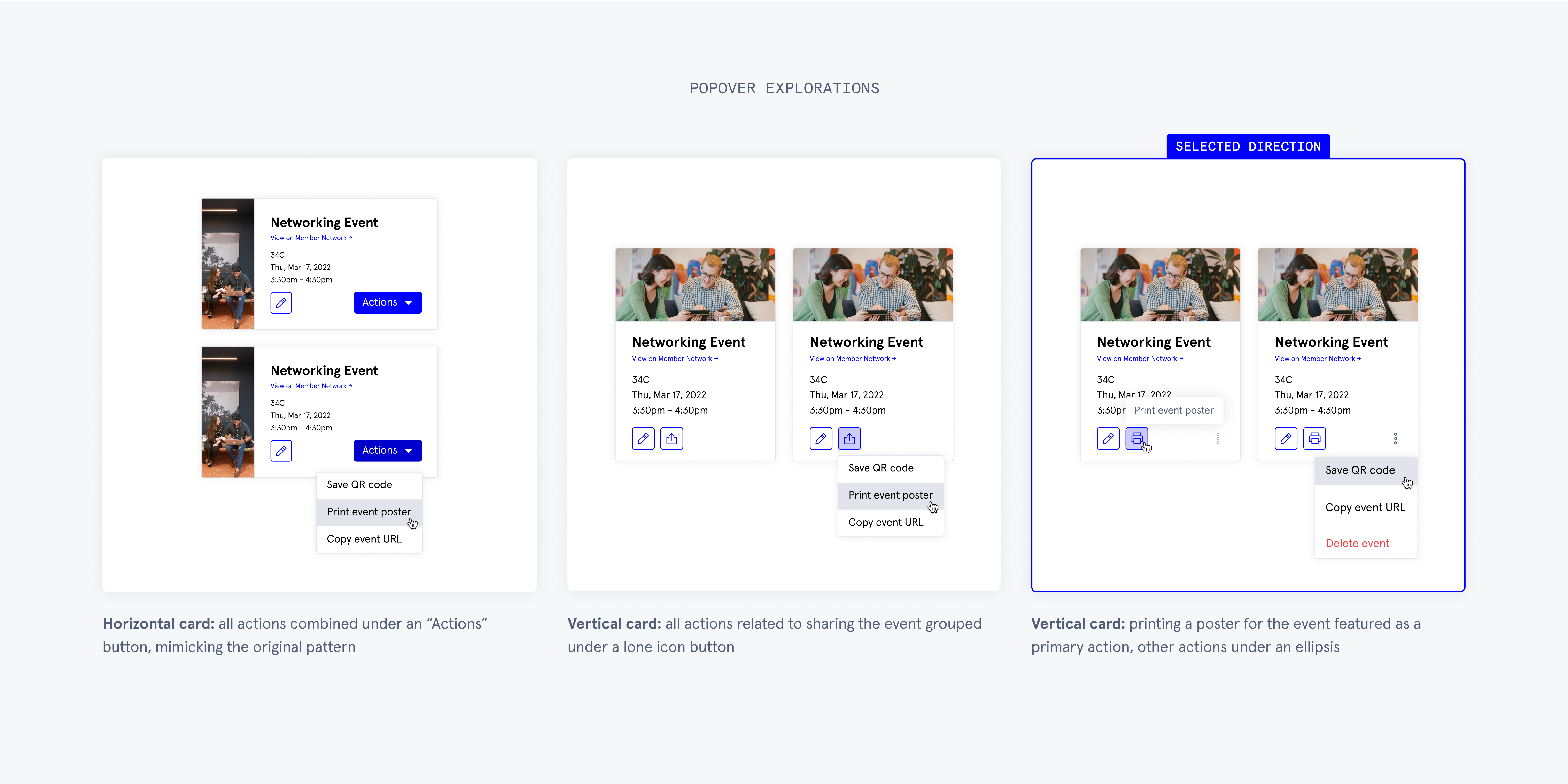
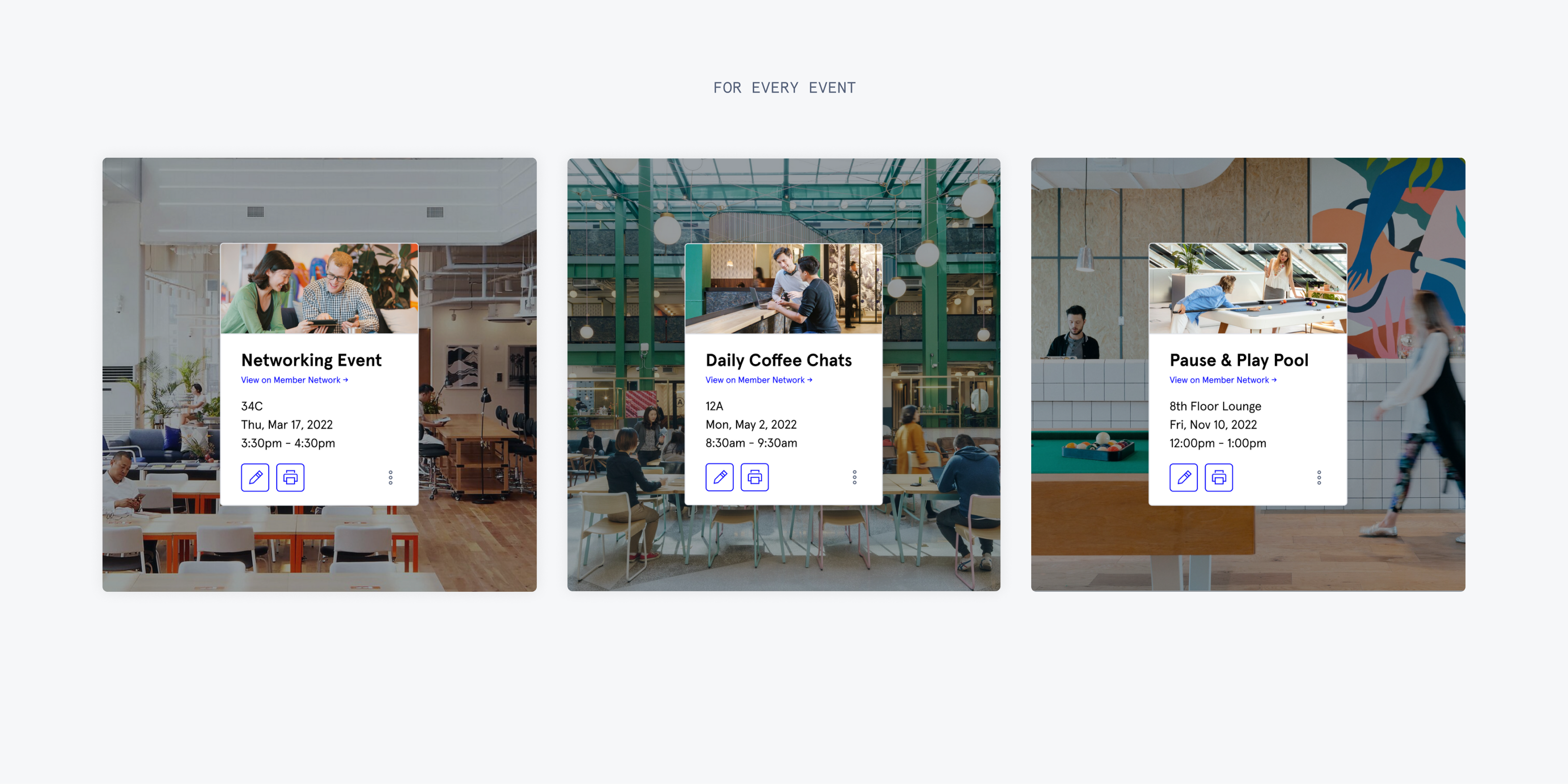
I iterated on the popover card since it would now appear in two places—where users preview an event’s details while creating an event, plus where they see it on the calendar after publishing.
- Switching to a vertical card layouot promotes space efficiency on the calendar. This orientation also presents the content more effectively, as most images in our library exist in landscape format.
- Working with the data team, I learned printing a poster is the most common action after an event is created. This informed the decision to prioritize printing as a primary CTA.
- Adding a delete button enables users to remove events from the calendar without having to re-enter the editor flow.


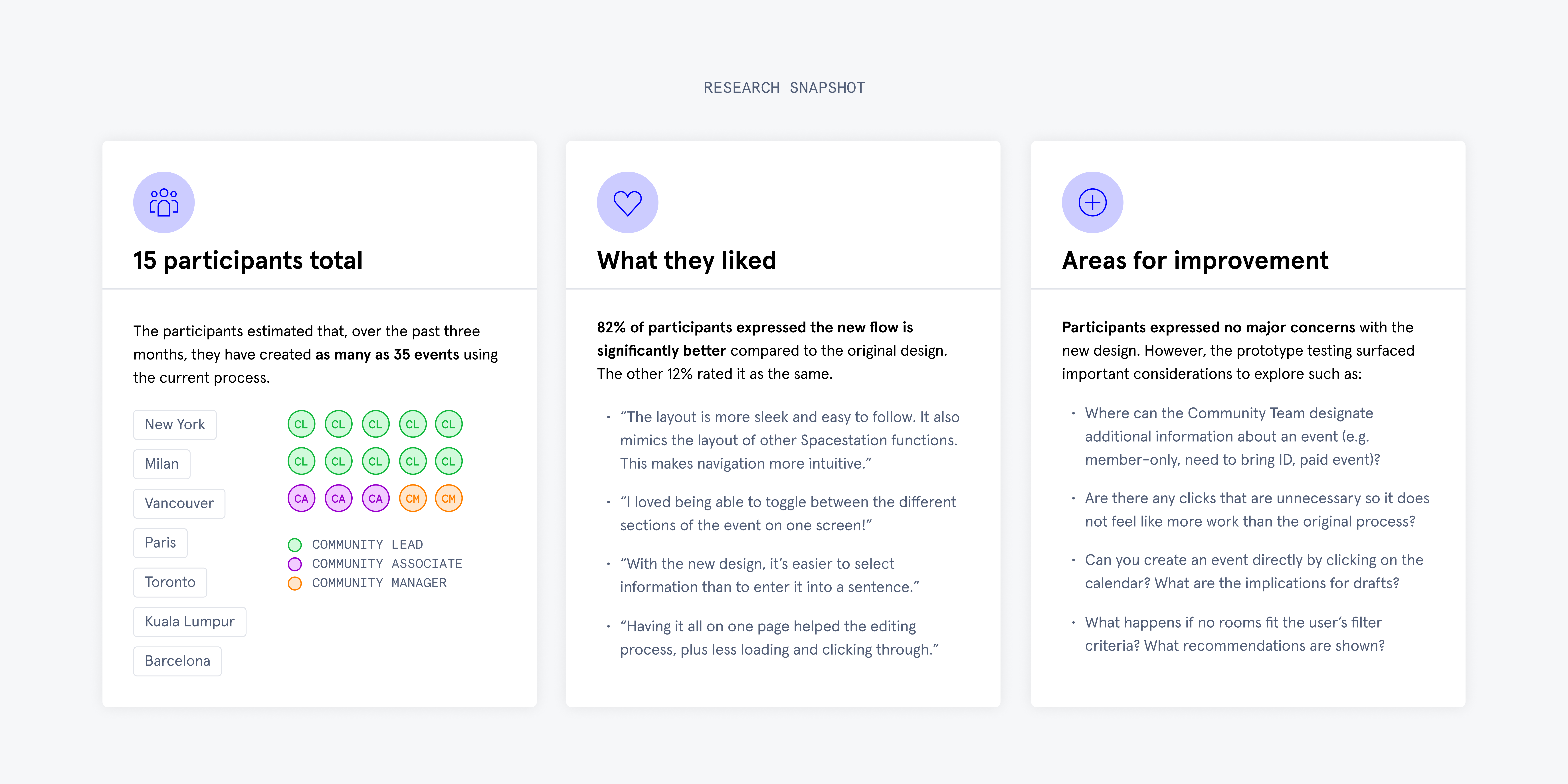
In testing, the new approach resonated with employees and yielded faster completion times than the 1:1 version.
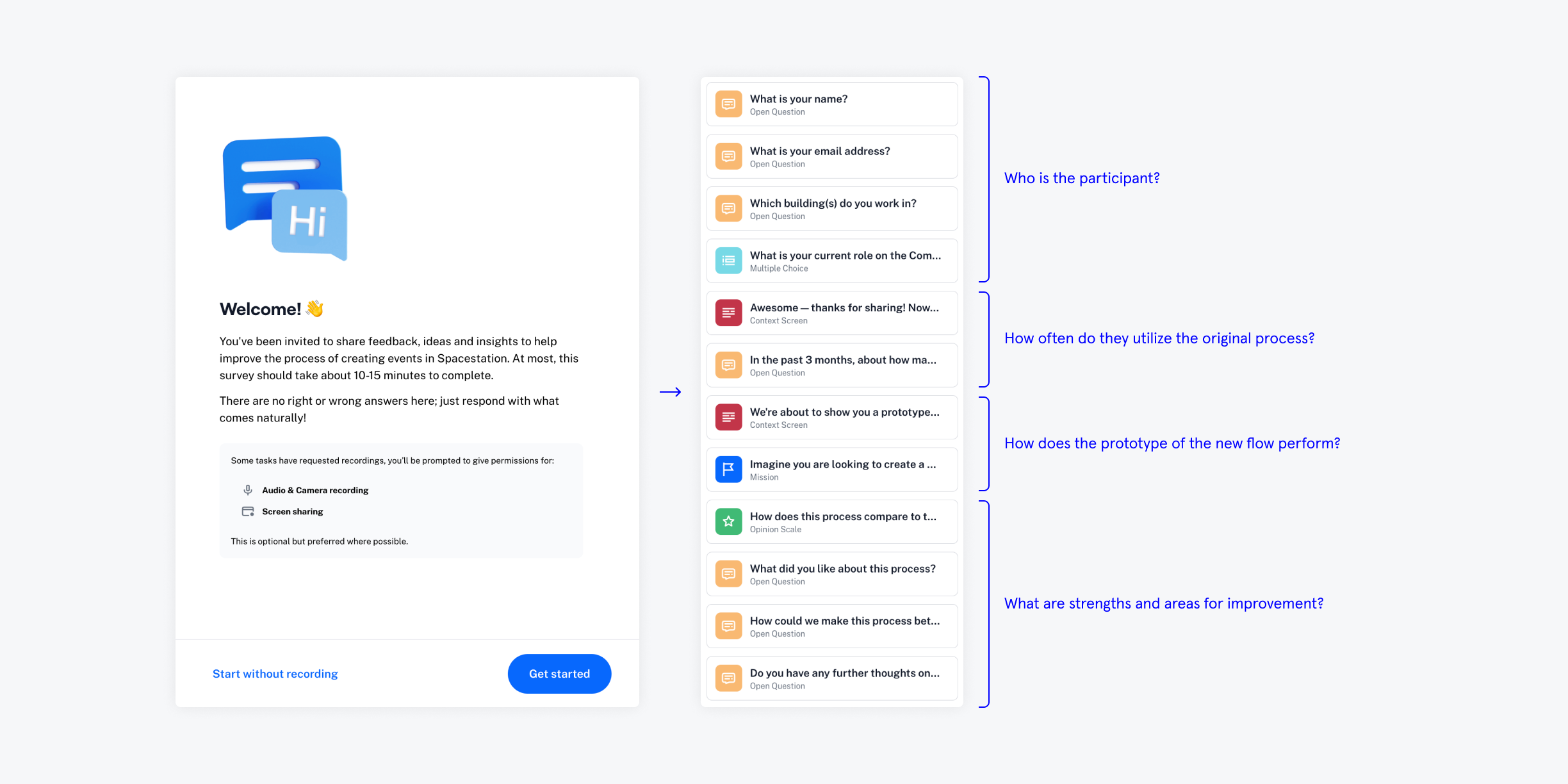
As I worked on this project, the team signed up for a Maze trial to explore its capabilities. I was the first designer to utilize it, concluding asynchronous testing was an appropriate method to capture feedback here. The goal was to test the adjustments in functionality and application of our new design system.
After embedding my prototype and applying feedback from researchers, I sent the survey to Spacestation power users. The feedback was largely positive and affirmed the long-term value of bigger changes when compared to the 1:1 version.
After embedding my prototype and applying feedback from researchers, I sent the survey to Spacestation power users. The feedback was largely positive and affirmed the long-term value of bigger changes when compared to the 1:1 version.
After reviews with design, product, and engineering teams, my new approach received approval for implementation.
The user testing helped bring everyone on board with the new approach, understanding that the level of effort to build this version would be higher but ultimately reduce the tech debt Spacestation faces and increase designer velocity in implementing new features.
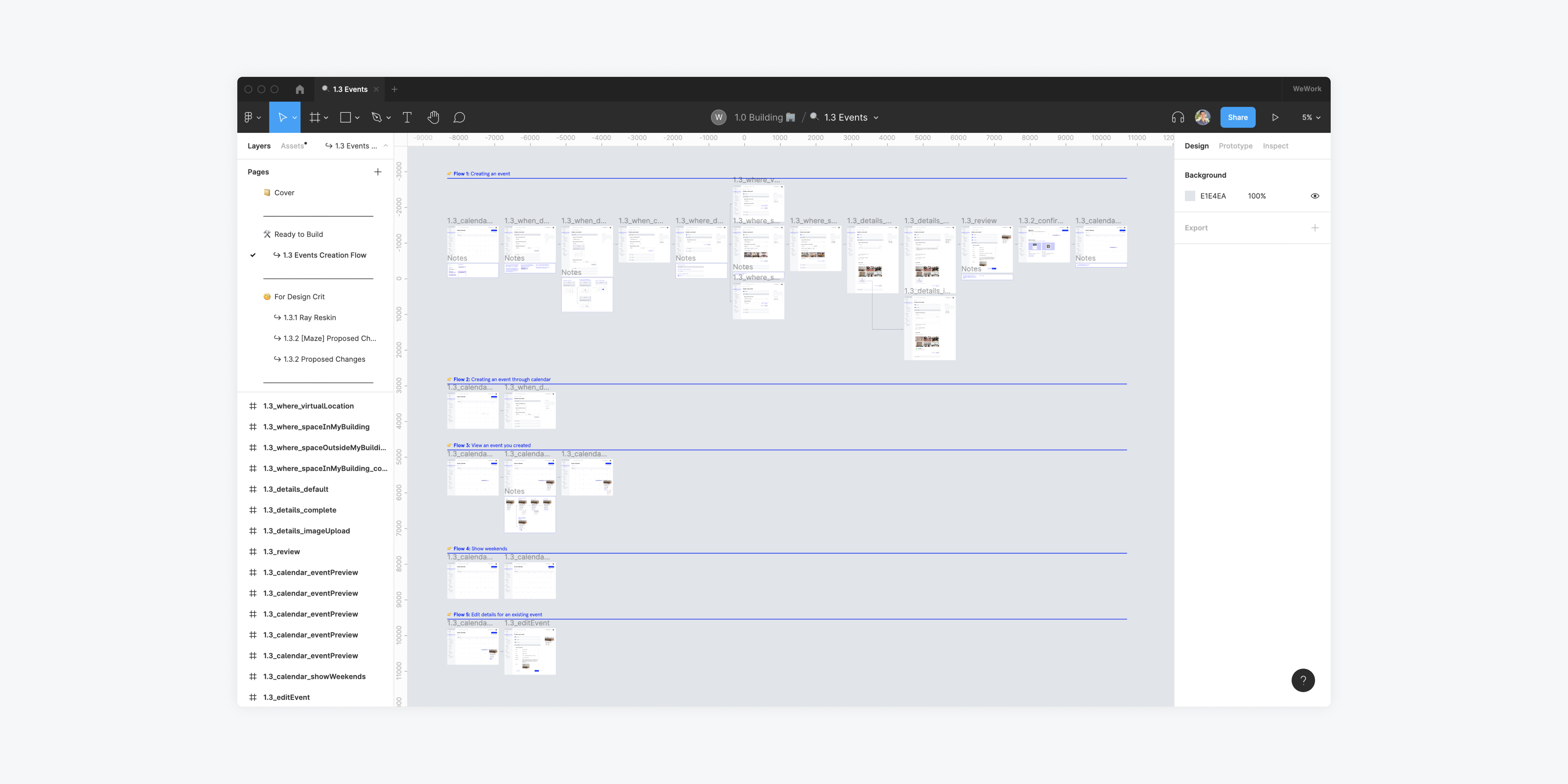
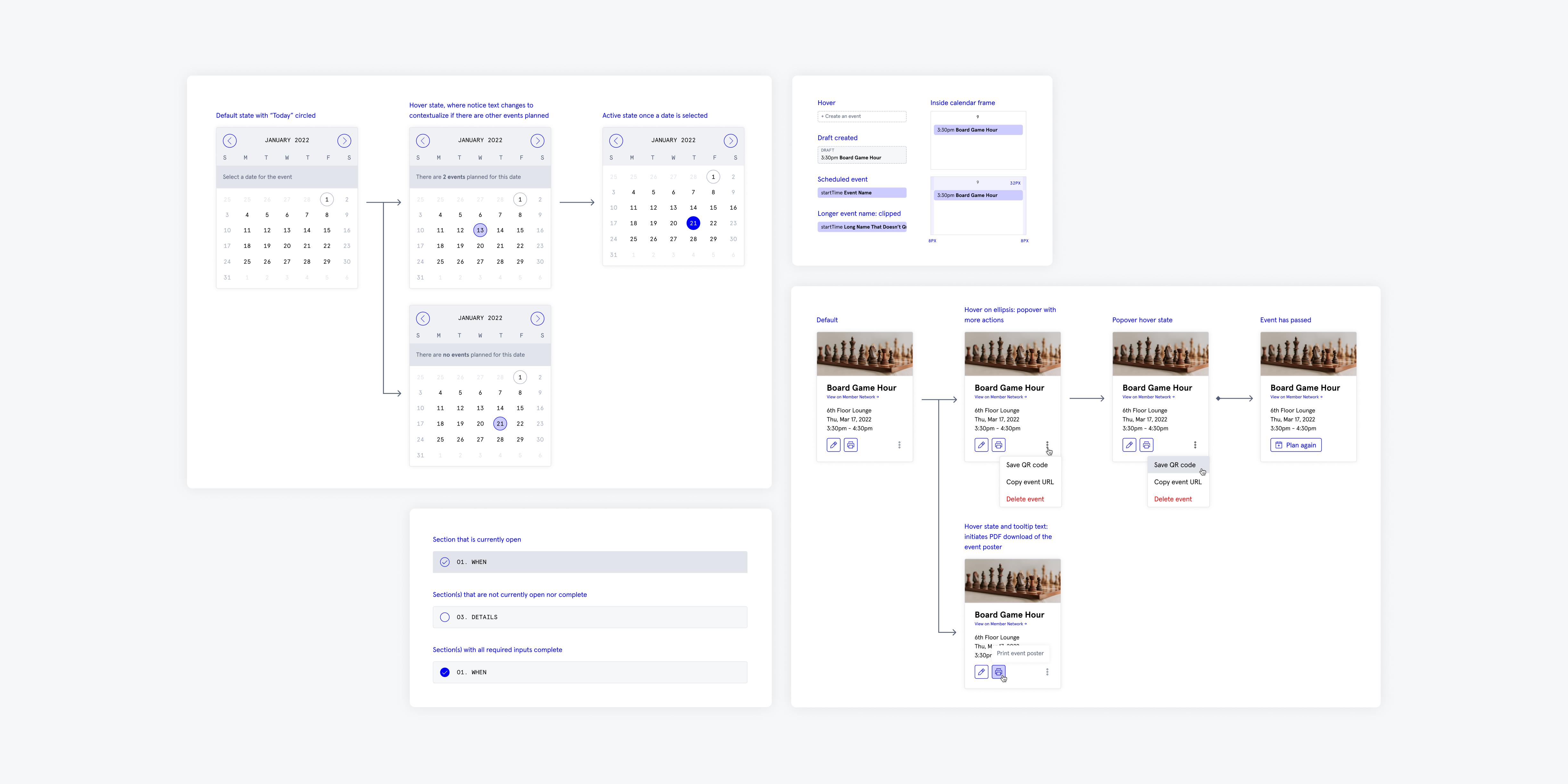
I used the team’s feedback to finalize the flow. To prepare for development, I created a file articulating details for states, alternate use cases, and acceptance criteria.
I used the team’s feedback to finalize the flow. To prepare for development, I created a file articulating details for states, alternate use cases, and acceptance criteria.
Conclusion
WeWork’s old design system is one of Spacestation’s largest dependencies. My work set an instrumental precedent in unblocking the team from introducing new features. During my walkthrough with the engineering team, everyone was thrilled about the redesign and shipped it within the month.
This project was a meaningful opportunity to work within defined constraints while also advocating for improvements that benefit users and the business. Throughout the process, I learned to continuously integrate input from multiple stakeholders to inform each iteration and gauge potential tradeoffs.
I fulfilled the original ask but, upon seeing the opportunity to make major improvements, I dedicated time to exploration and ultimately delivered a more impactful solution.