Epicure
2021
Challenge
Food allergies have an undeniable impact on quality of life in social and health contexts. For those affected, finding safe restaurants is a major challenge. One notable barrier is a lack of consistent and centralized information online. As patrons vote with their dollar, there is an opportunity to elevate businesses who excell in accommodating diners.
Outcome
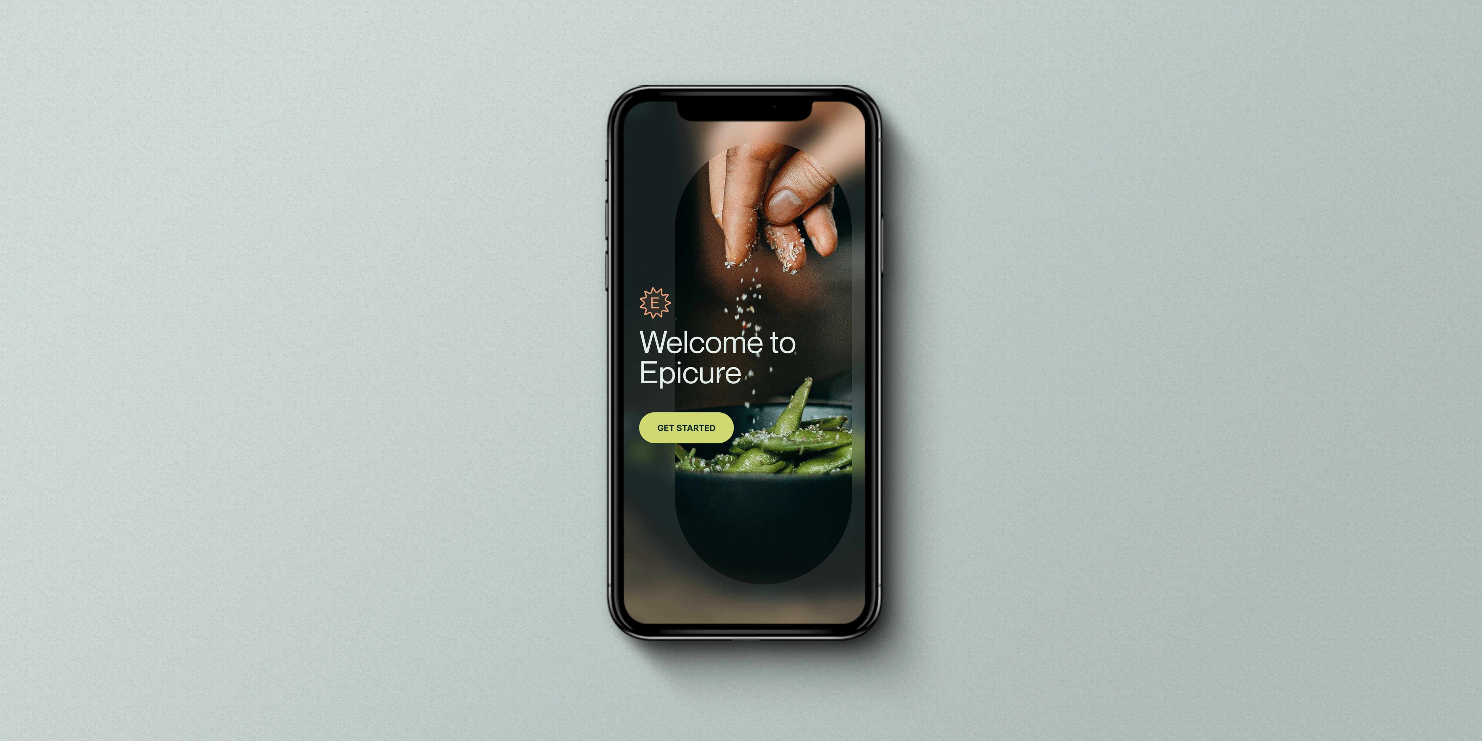
Epicure is a crowdsourced directory for people with dietary restrictions and those who support them. The app provides diners peace of mind when eating out. Features include browsing restaurants, posting detailed reviews, and relaying accurate information. Epicure acts as a community resource to locate holistic, dietary-specific perspectives.
Epicure is a crowdsourced directory for people with dietary restrictions and those who support them. The app provides diners peace of mind when eating out. Features include browsing restaurants, posting detailed reviews, and relaying accurate information. Epicure acts as a community resource to locate holistic, dietary-specific perspectives.


Filters
Sort through restaurants by dietary restrictions, personal criteria, and location preference. Apply saved profiles to find safe places for outings.
Collections
Curate a collection of restaurants to try. Collaborate with others to document the best options.
Community Reviews
Write and post a review to share. Provide details like specific dietary restrictions and items ordered, then speak to the nuances of your experience.
Operator Insights
Outline restaurant protocols and allergens present in menu offerings. Post verified updates and edit business details as circumstances change.
Although variables like ingredients and sanitation practices can be controlled when cooking at home, dining out is a different story.
I began by conducting secondary research and facilitating conversations to better understand diners’ experiences. I spoke with eight people living with food allergies, three parents, and two allergy specialists.
I learned that, at restaurants, the safety of people with dietary restrictions falls entirely into the hands of staff. This leads to high-stress moments at every step—from evaluating whether a place is safe to taking the first bite.
I learned that, at restaurants, the safety of people with dietary restrictions falls entirely into the hands of staff. This leads to high-stress moments at every step—from evaluating whether a place is safe to taking the first bite.


What is the opportunity?
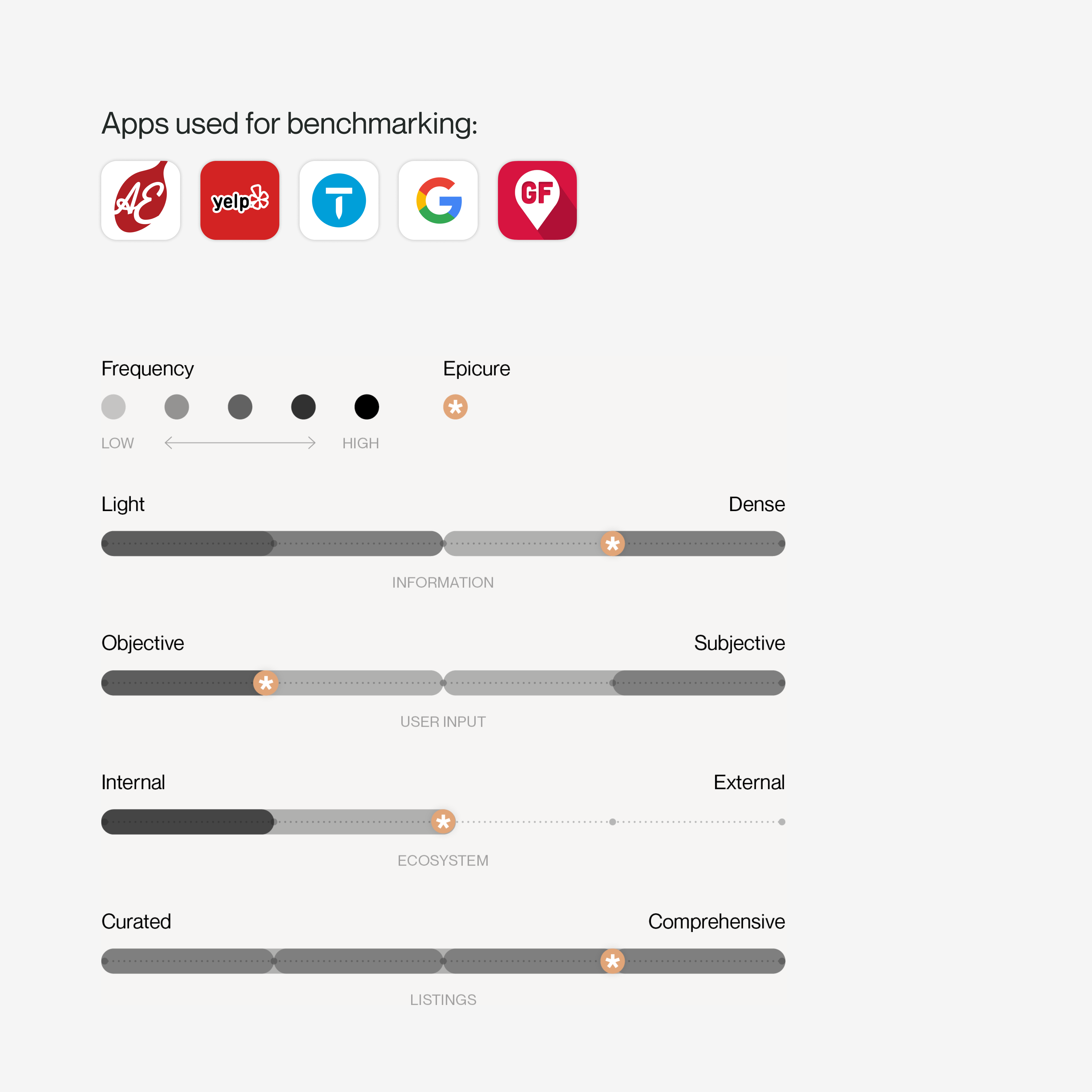
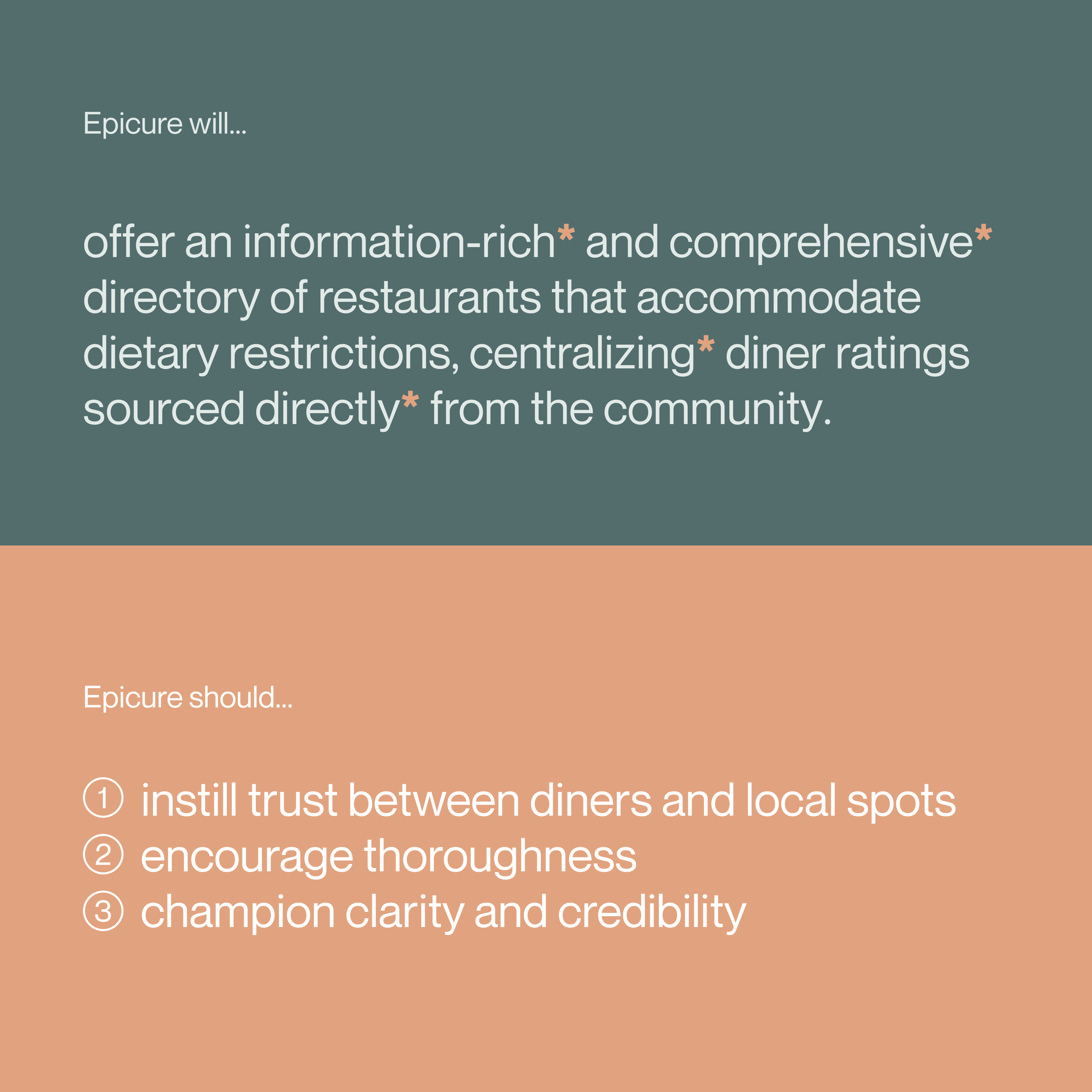
There are multiple digital platforms already focused on locating allergy-safe restaurants. I audited five apps to identify opportunities for improvement. To position Epicure, I plotted the attributes found in these competitor platforms to define a new experience that instills trust, encourages thoroughness, and champions clarity & credibility.

As eating is a communal experience, this platform must consider the needs of multiple users—not just those with dietary restrictions.
Through benchmarking, I realized similar apps focus solely on the individuals with dietary restrictions. Epicure can meet these people’s needs but also has the opportunity to support loved ones looking to help, plus encourage restaurant owners who are looking to share their practices.
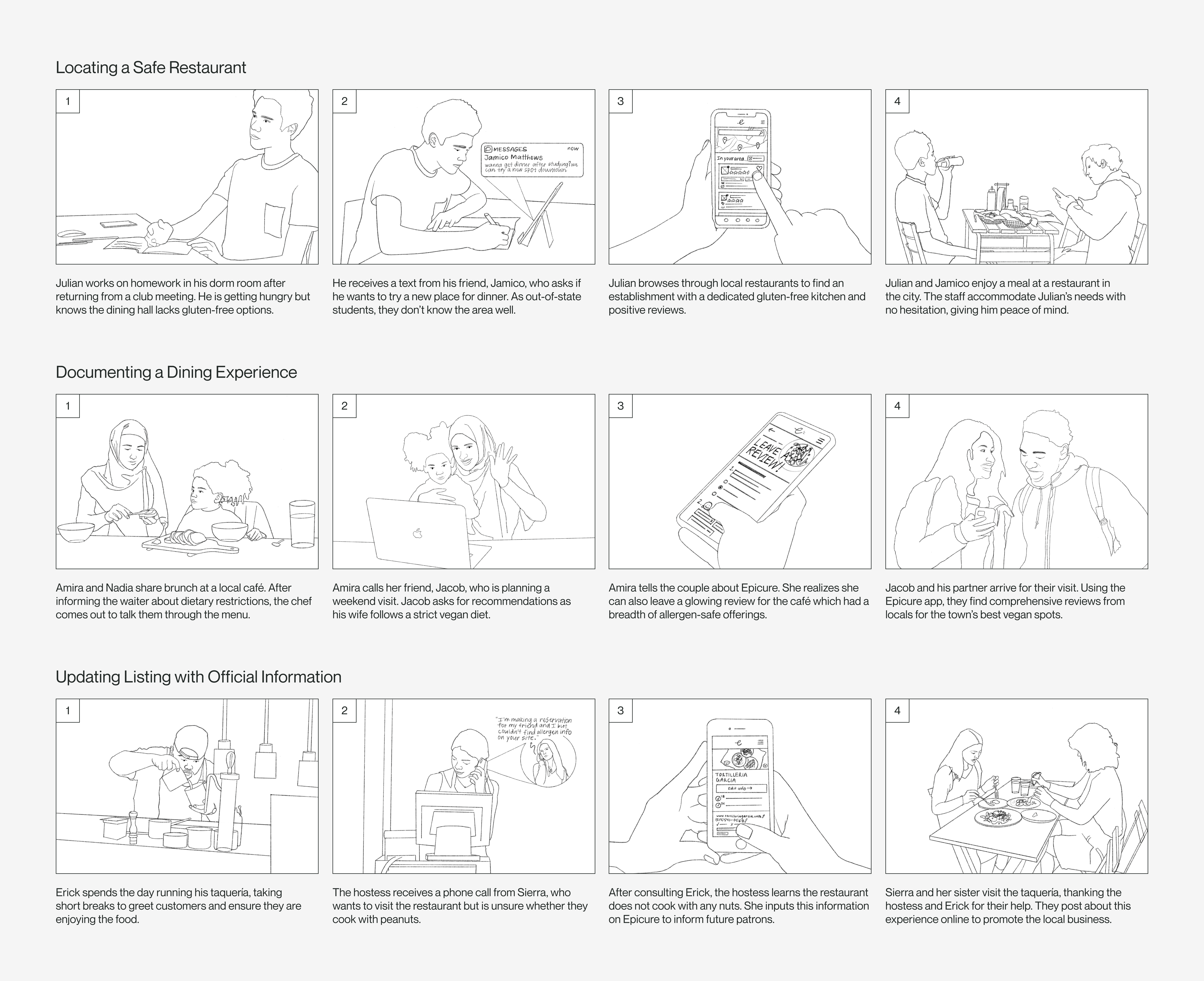
With this in mind, I articulated three personas and accompanying scenarios to guide meaningful use cases for the app. These artifacts uncover how this platform can support diners across their entire journey—from locating a restaurant, to documenting an experience, and lastly updating listings with verified information.
With this in mind, I articulated three personas and accompanying scenarios to guide meaningful use cases for the app. These artifacts uncover how this platform can support diners across their entire journey—from locating a restaurant, to documenting an experience, and lastly updating listings with verified information.

Moving from defining the problem to designing an intervention, I found it important to consider existing mental models for navigating a directory.
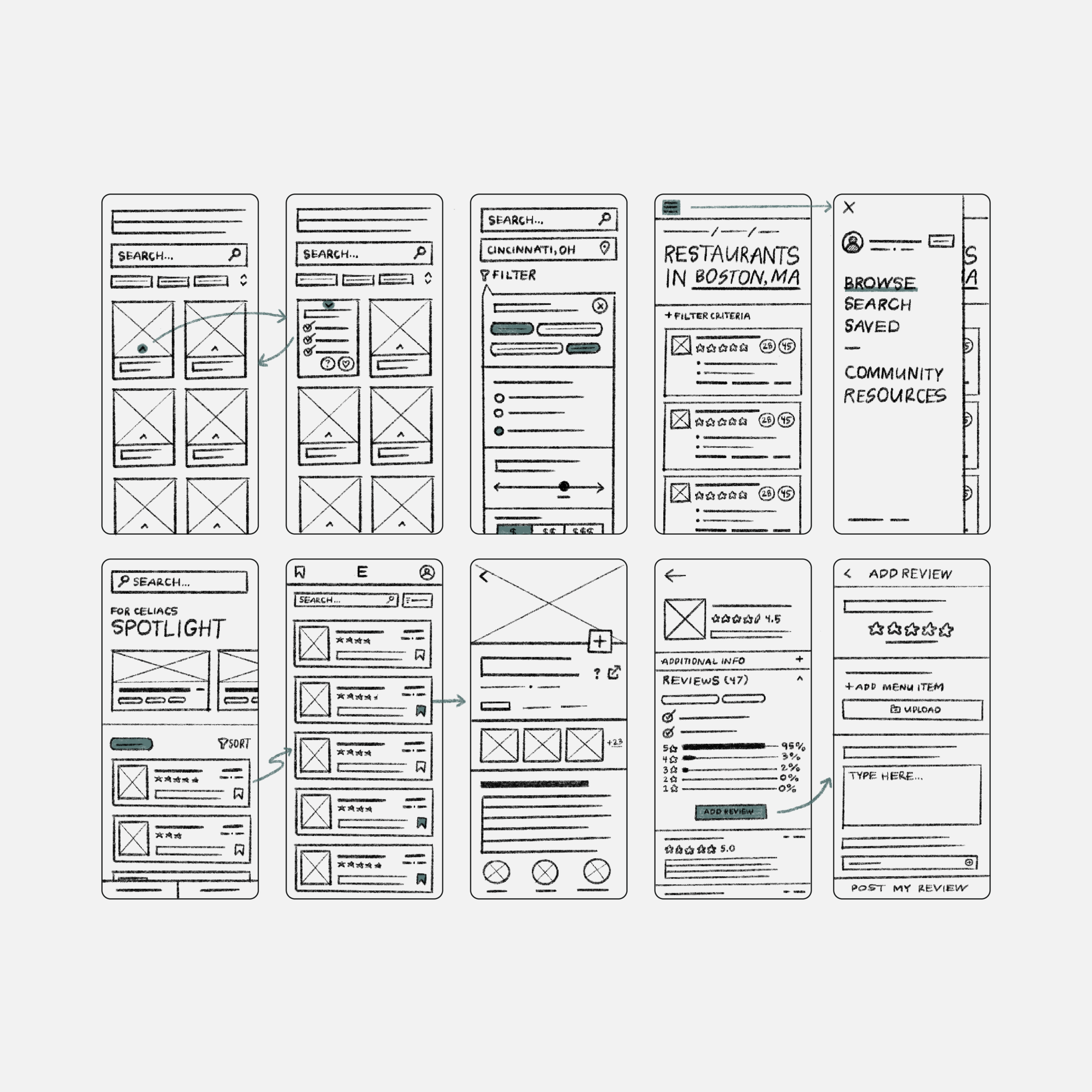
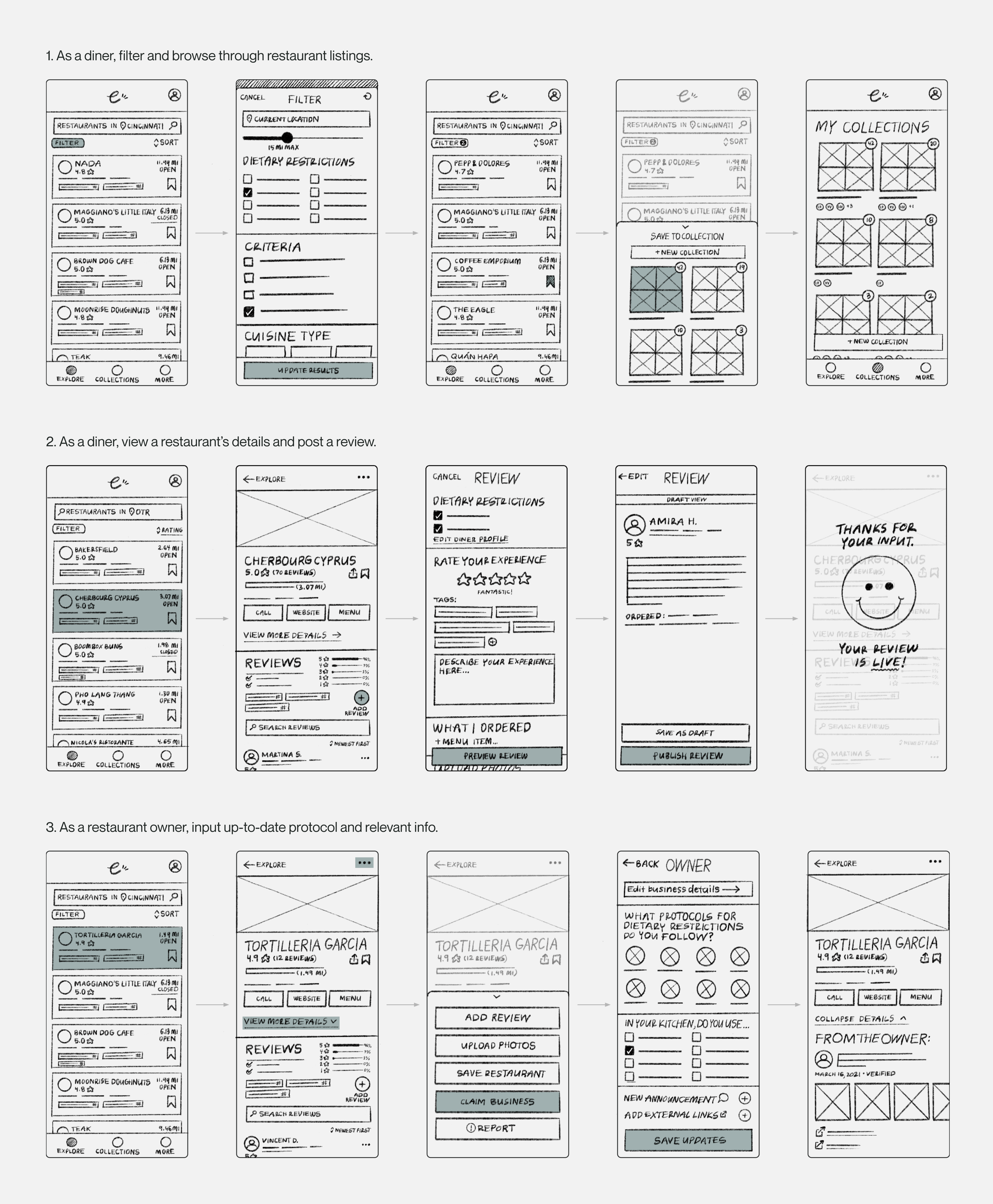
With restaurant listings, there is a high volume of information to communicate—such as location, hours of operation, menus, reviews, photos, and social media links. Therefore, hierarchy and layout are critical to ensure diners feel informed but not overwhelmed. I sketched thumbnails to identify how key information should be structured to promote understanding.
Sketching was a helpful method to explore how these considerations translate into one experience, which informed decision-making for the app’s information architecture. With Epicure, people can explore restaurants, post reviews, and provide official information.
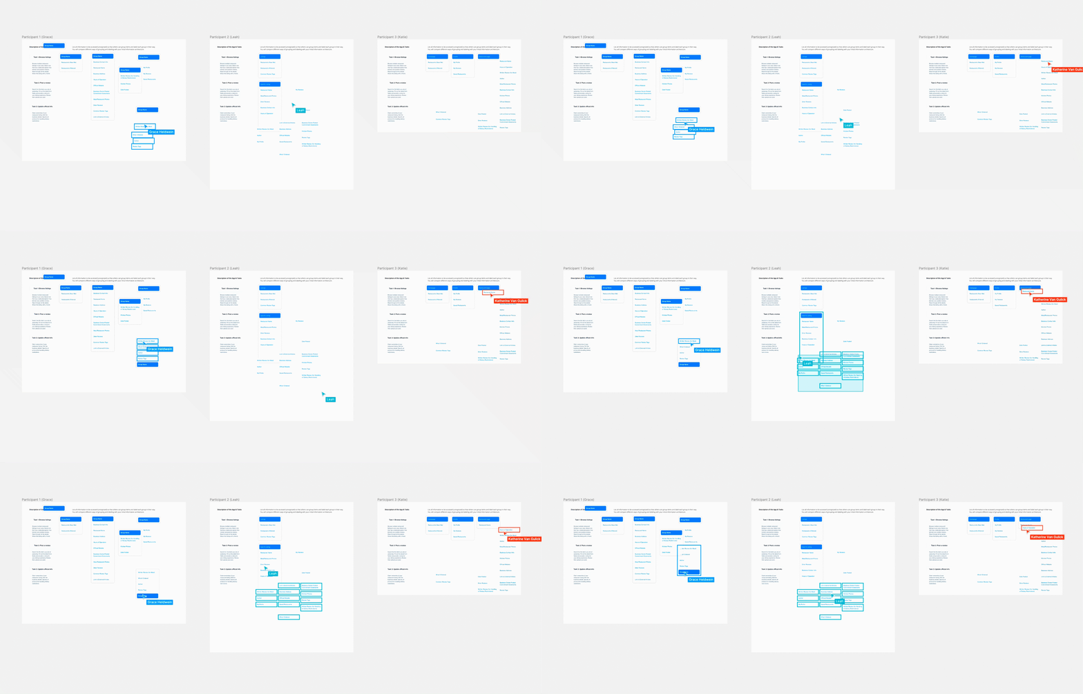
In a card sorting activity, I invited participants to organize every piece of information. Their input revealed additional opportunities to organize the content by category.
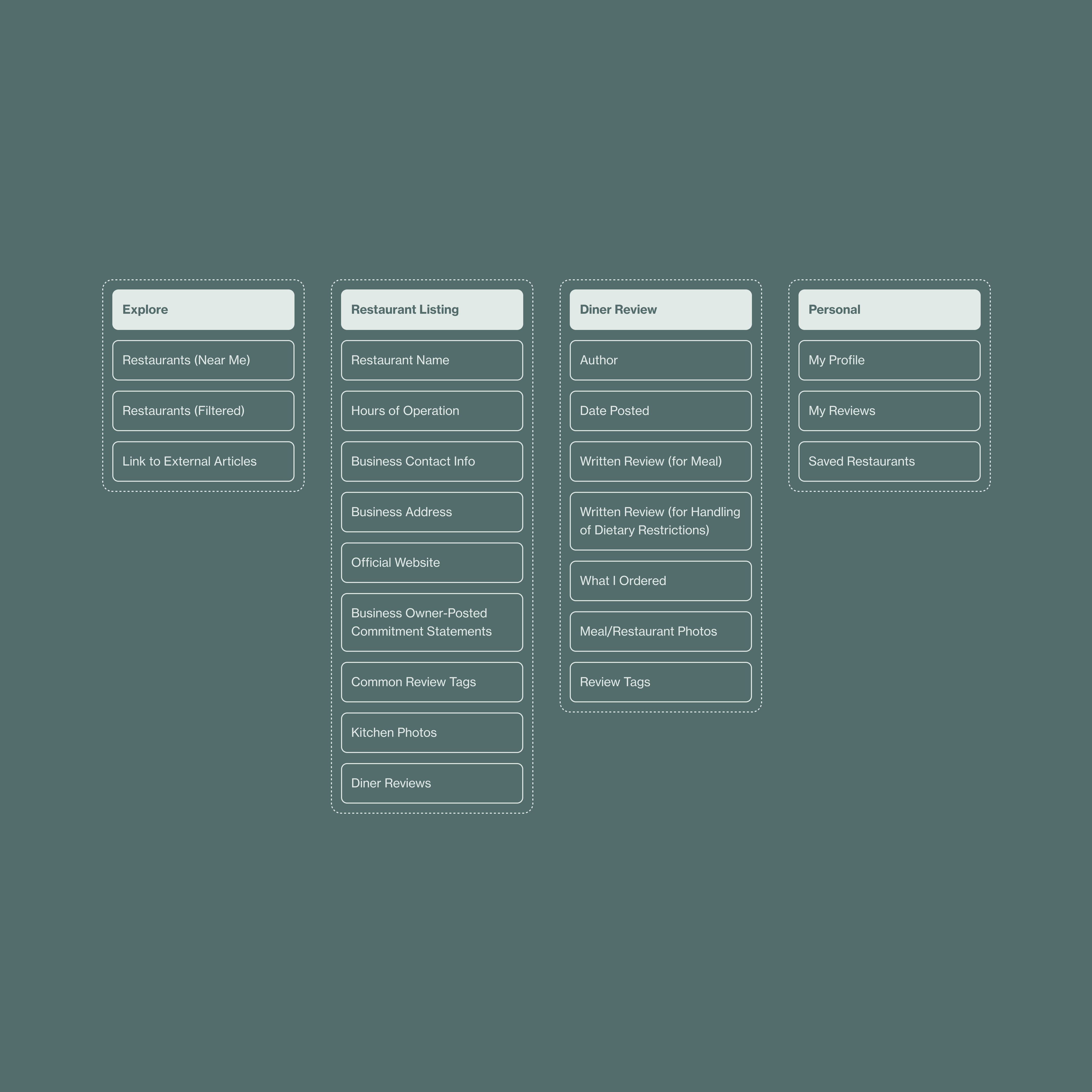
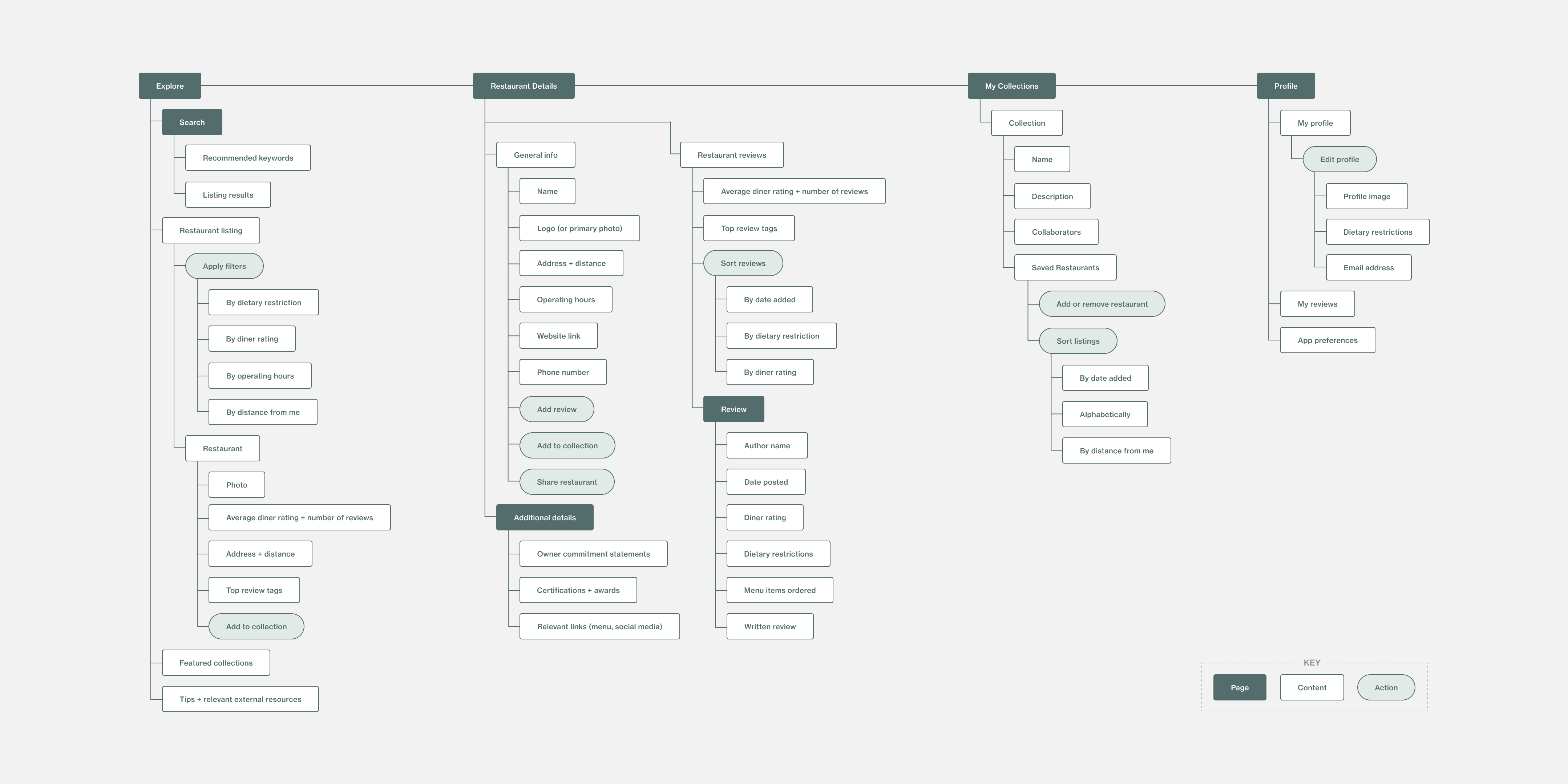
Once I felt confident about the structure and logic behind the content, I articulated how users would navigate through it from various dimensions.
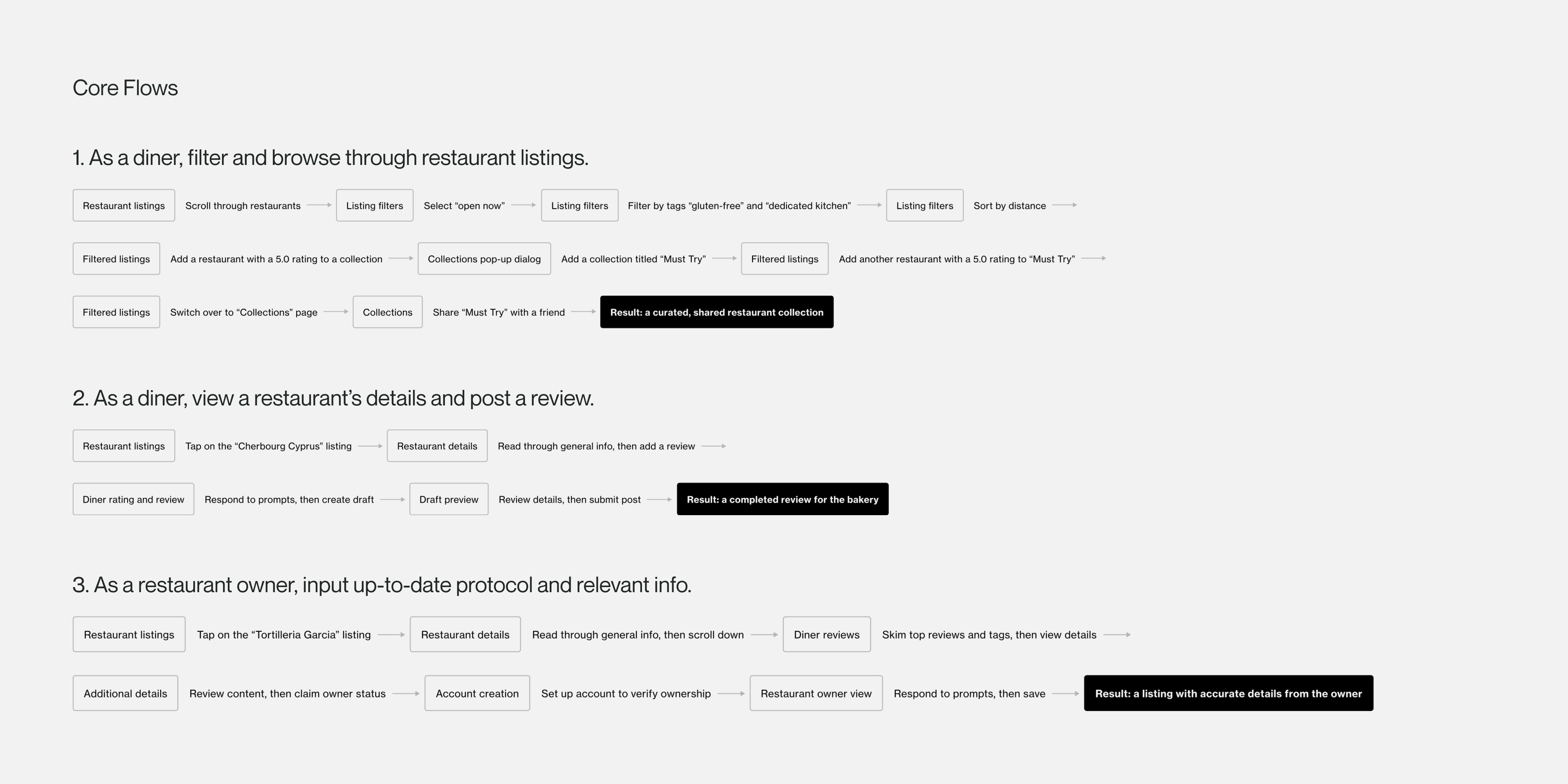
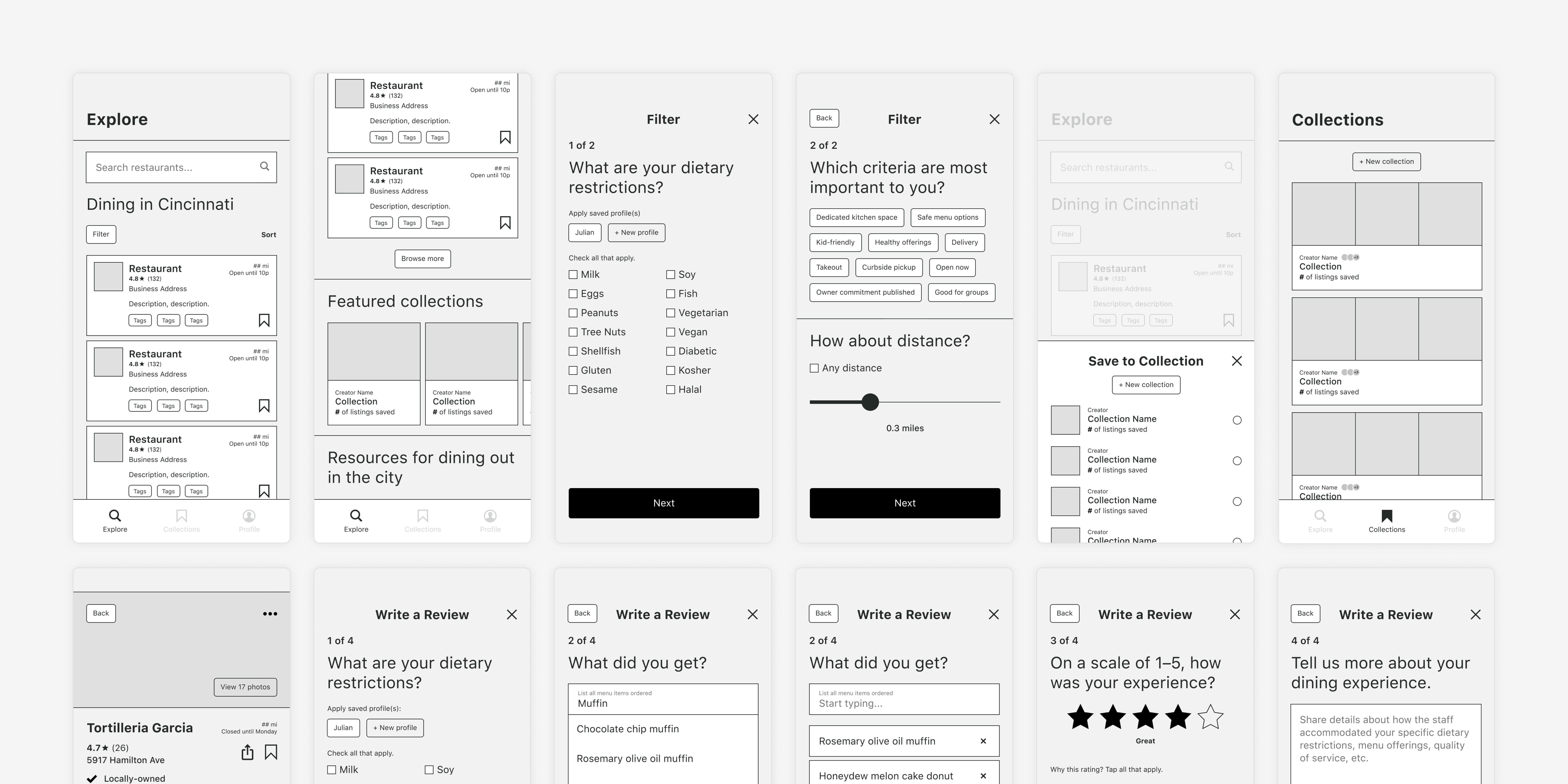
Through additional sketches and low-fidelity prototypes, I focused on exploring and refining options across three primary task flows:
- Filter and browse through restaurant listings.
- View a restaurant’s details and post a review.
- Input up-to-date protocol and relevant information.


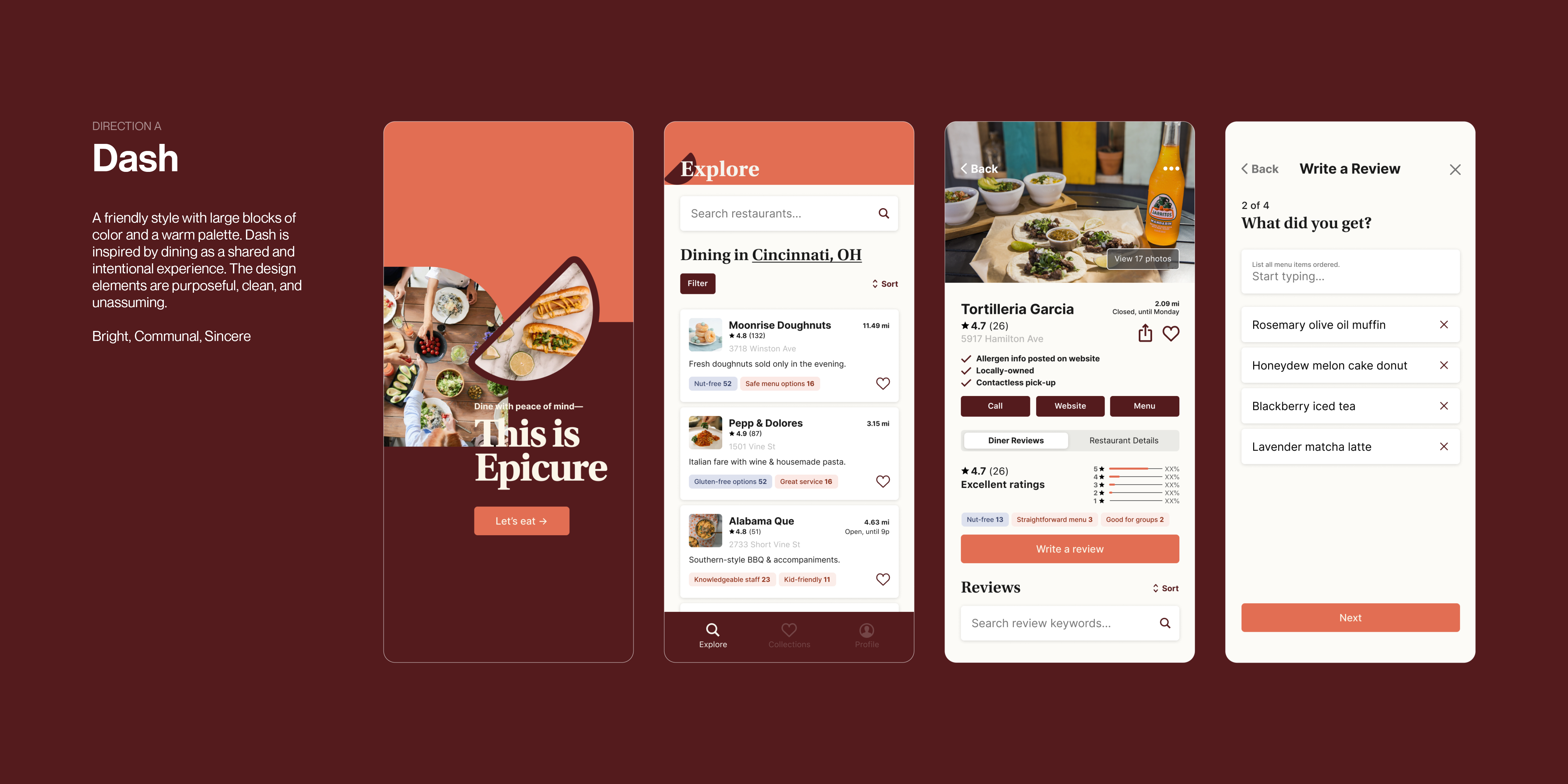
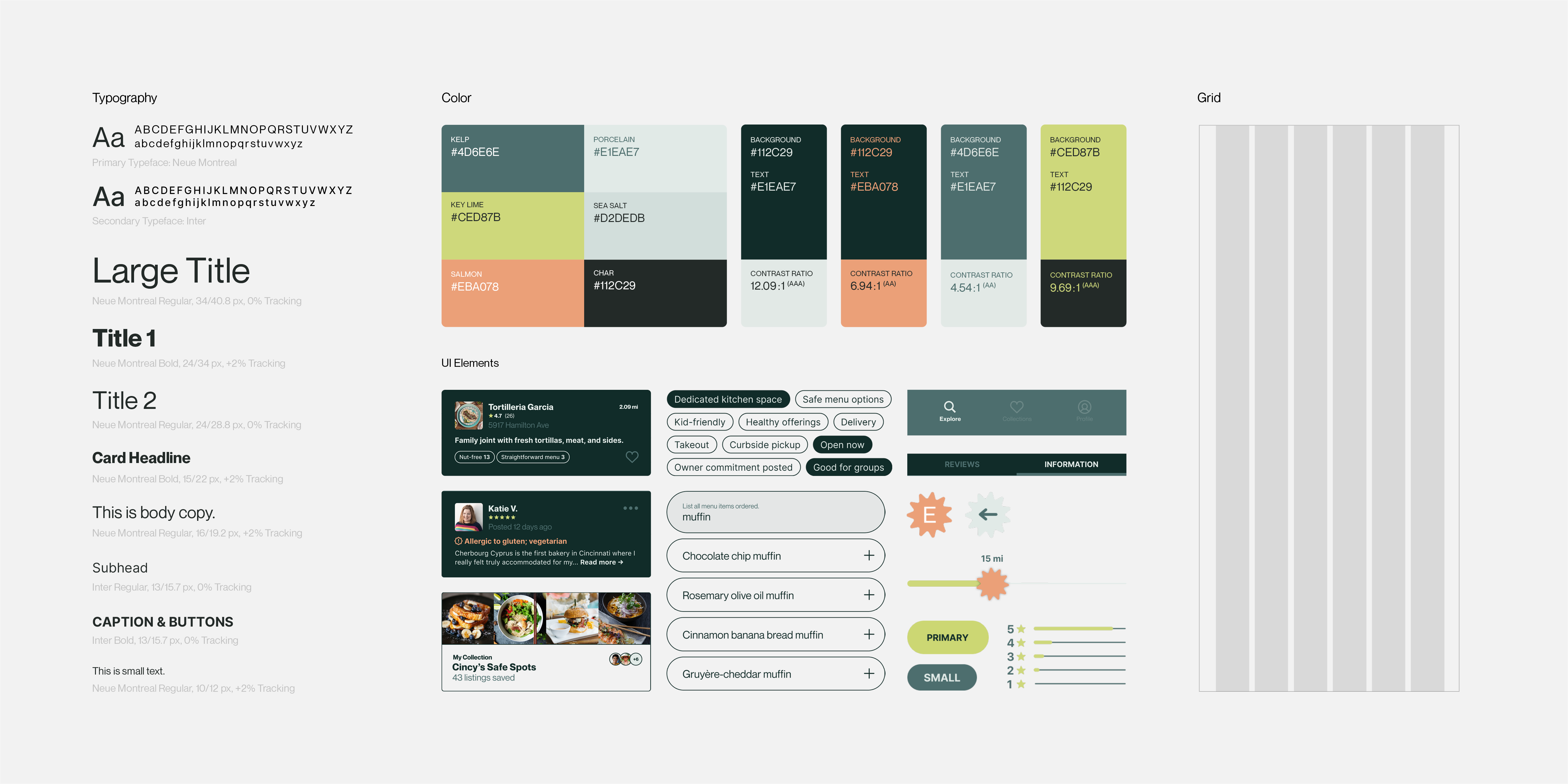
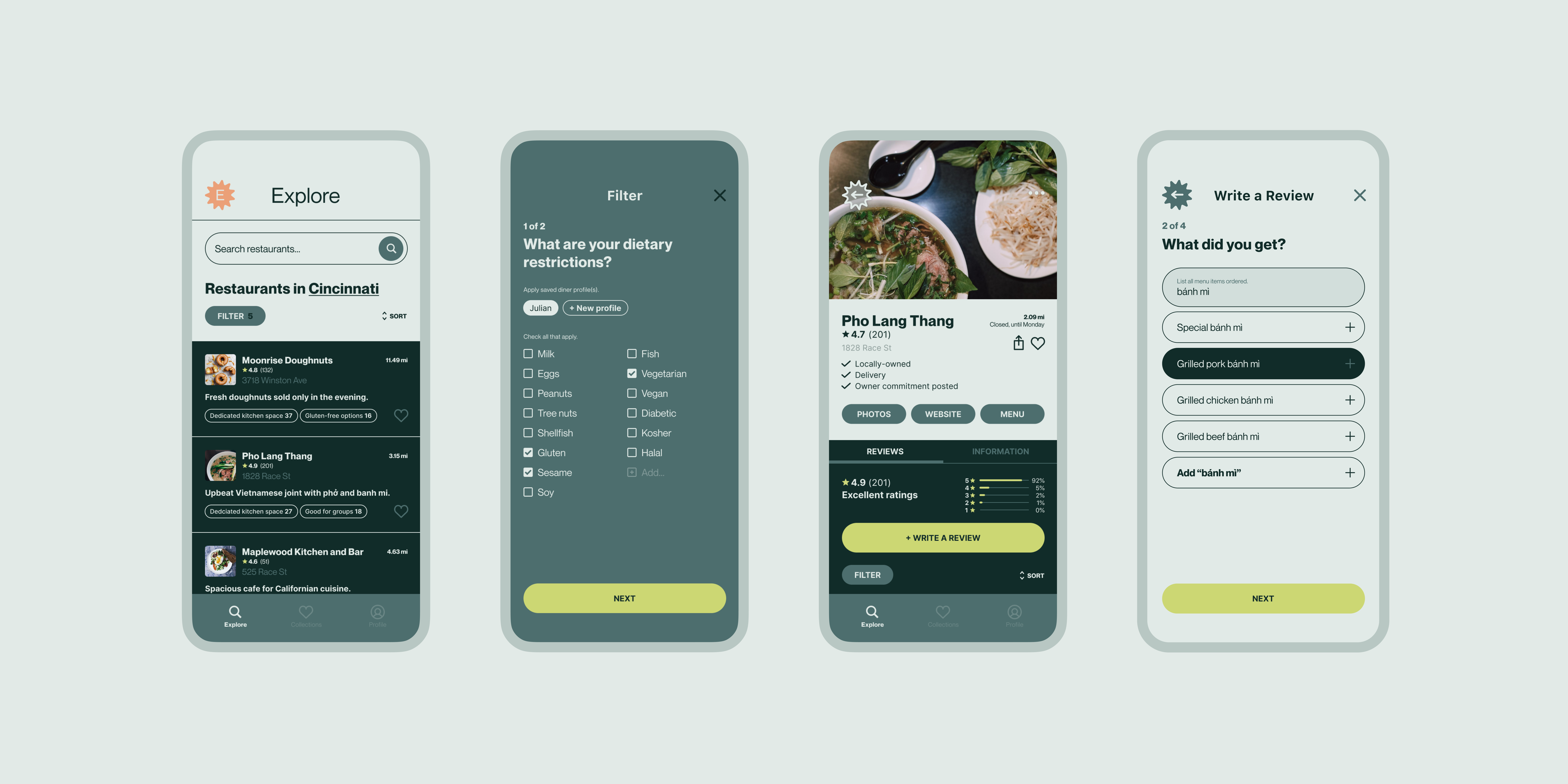
Evolving the designs into a higher fidelity, I created two visual systems expressing distinct goals and characteristics.
Based on the feedback received, I chose to develop Candor by incorporating Dash’s successes. Peers praised Candor’s vibrant palette and decisive focus on the smaller elements. Its bold style stands out in the domain of food allergies, which is often presented as overly clinical or condescending. To enhance cohesion, I reconsidered padding, typography, and icon design.
